Web App
University of Northampton
PROSPECTUS APP
The University of Northampton (UON) is one of the youngest universities in the UK, but is one of the few universities to be ranked Gold in the Teaching Excellence Framework (TEF). They have won multiple awards for their work in the area of social impact, being the first university in the UK to be named as Changemaker Campus in 2012.
THE PROCESS
Challenge
UON needed to update their existing prospectus app, improving its UX and UI design, making it more user friendly, in order to provide a better user experience. The biggest challenge was trying to implement all these changes alongside the implementation of the new visual design UON has set for all its advertisement campaigns and printed materials.
Solution
APPROACH
I went through a deep analysis of the previous web app, highlighting the main UX and UI issues. After a meeting with the management, we set the new goals and purposes of the app and I started working on a new flows of information. I spent some time to research across our best competitors, setting up some testing in order to test the new flows.

Current prospectus app: home-subject-course | Tablet view
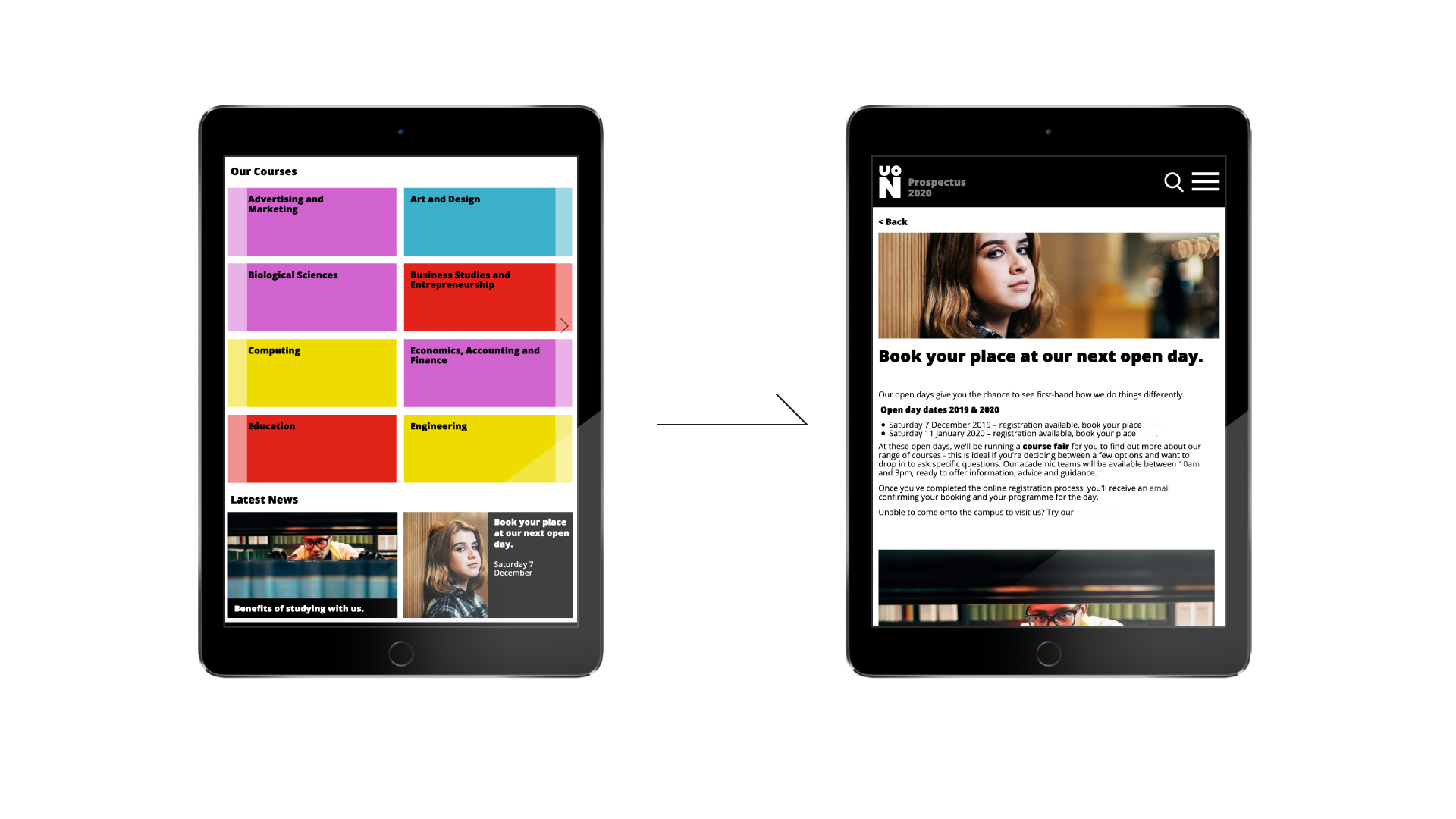
Current prospectus app: home-open day | Tablet view

Current prospectus app: home-subject-course | Mobile view
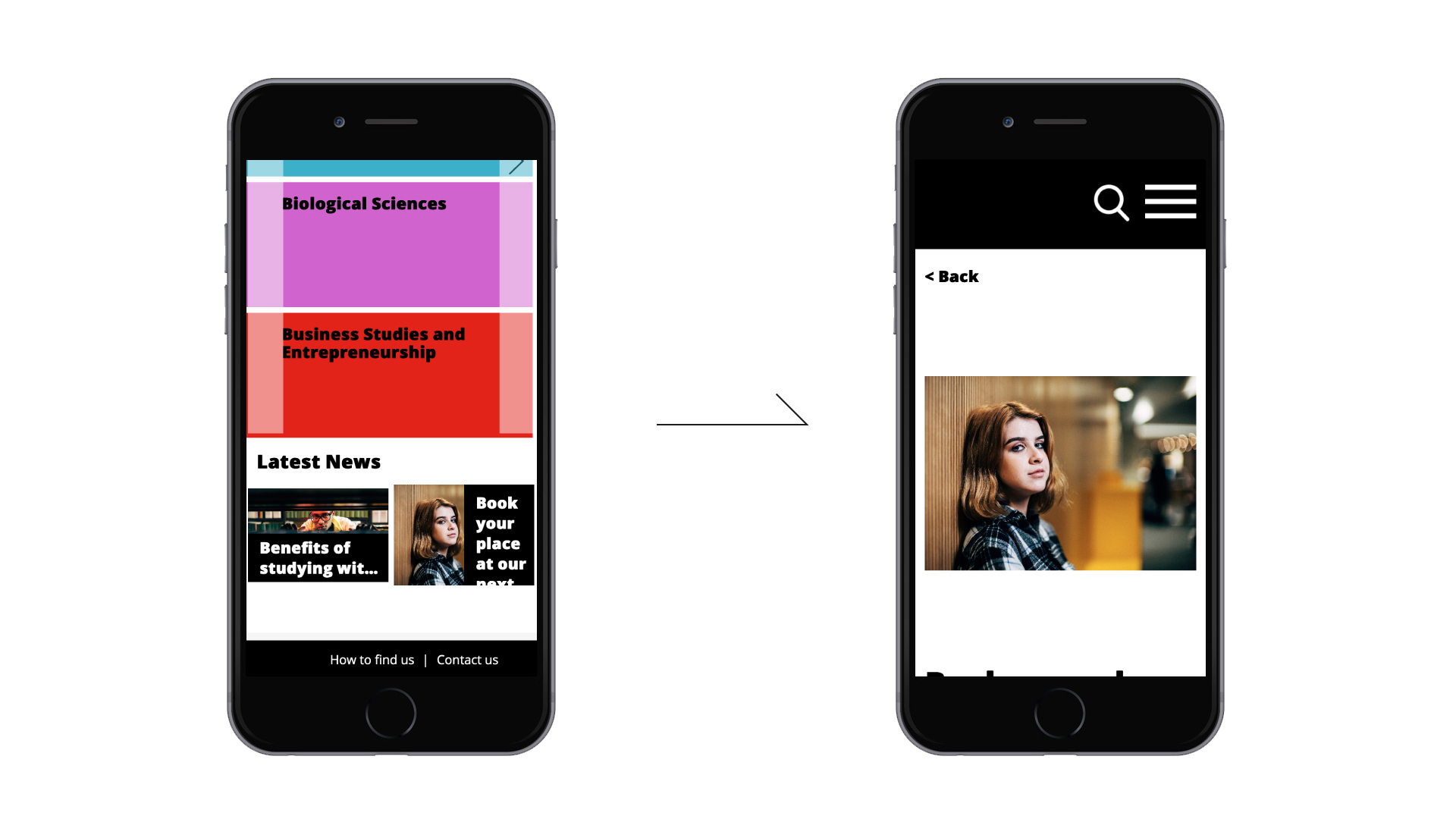
Current prospectus app: home-open day | Mobile view
DESIGN
After a bunch of sketching and brainstorming sessions, we concluded that the “must haves” for the app were: an easy access to the courses list, the possibility for the user to easily book an open day, providing further relevant information about the university. We wanted to keep things very simple and focused on providing courses information.
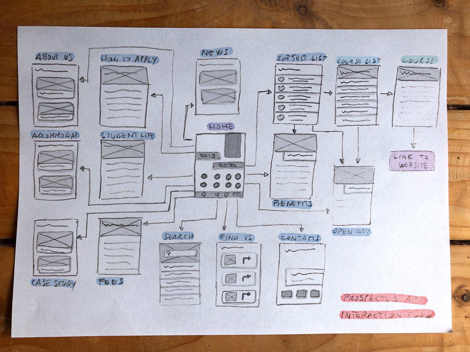
App interaction flow | Sketch
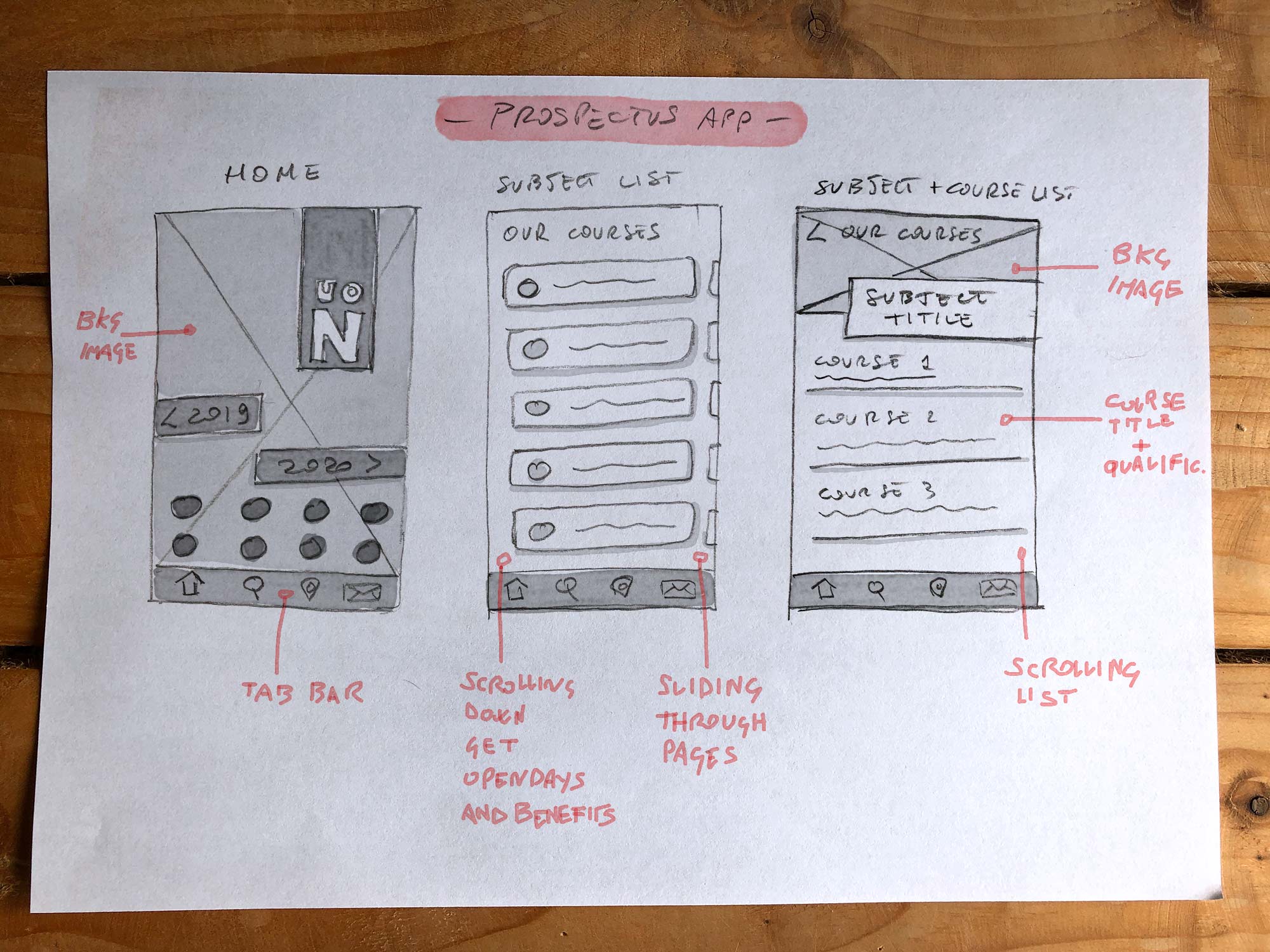
App screens design | Sketches
According with the brand and students recruitment managers I moved the sketches into an interactive mockup in order to start some preliminary testing. The management was satisfied by the preliminary testing results that demonstrated a better user engagement due to an improved user experience and a clearer user interface. We wanted an engaging way for prospectus students to get the first contact with the university.
Because most of our users were iPhone users, I characterised the new UI elements with a strong Apple style, however introducing home page icons in Android style. I focused on making every UI element self explicative, providing consistency between the app and the website. After looking at testing feedbacks and having numerous team discussions, we decided to base the app around the concept of quick and smooth view of the course content, providing at the same time an overview of the university.
Integrating the visual design was the most challenging aspect. Working with elements thought for printed material only was quite difficult, especially providing solutions for a complete responsive product.
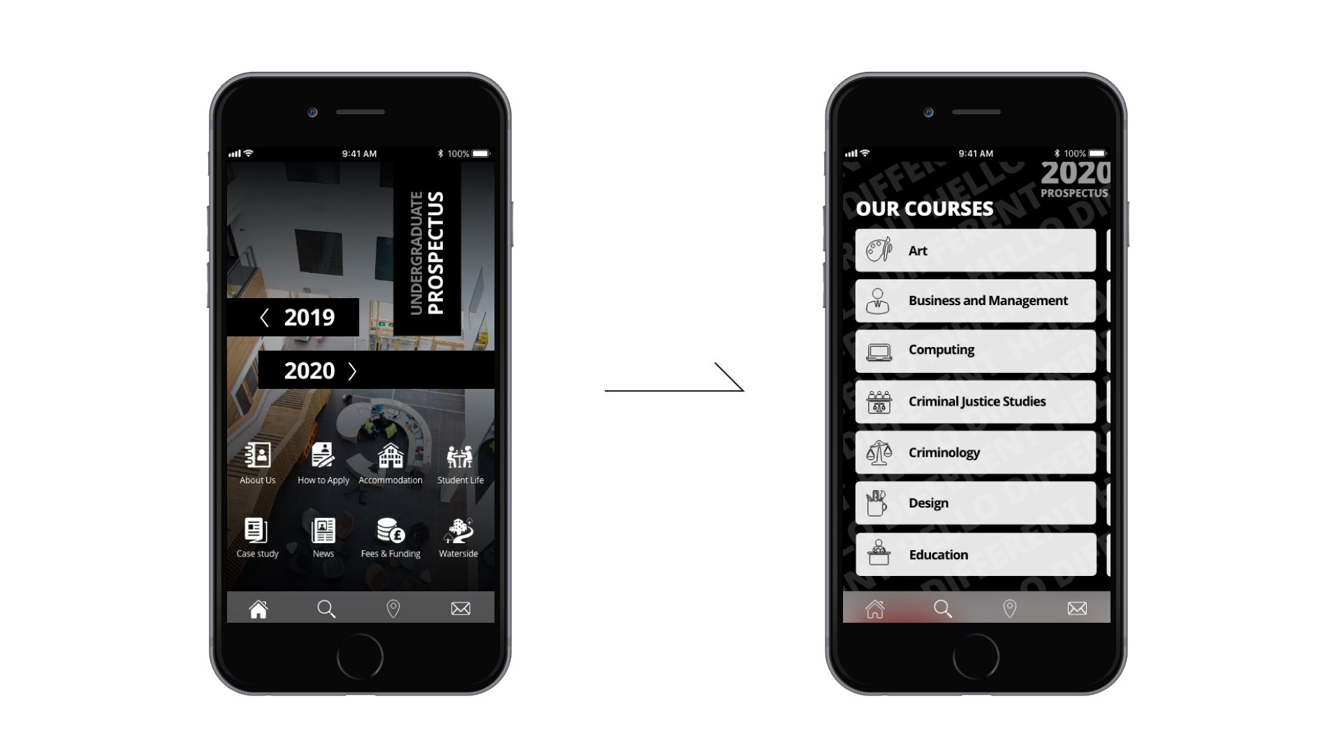
New Prospectus App: home-subjects list
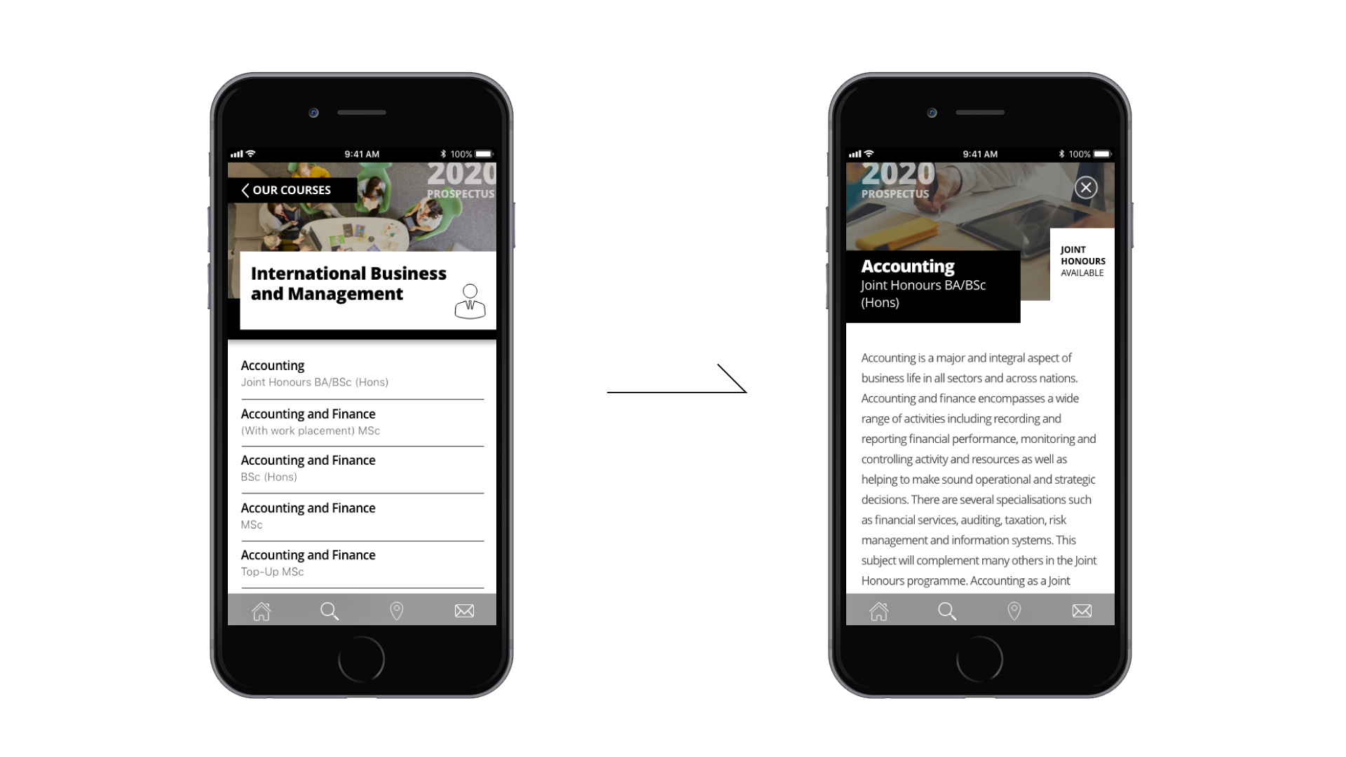
New Prospectus App: course list-course page
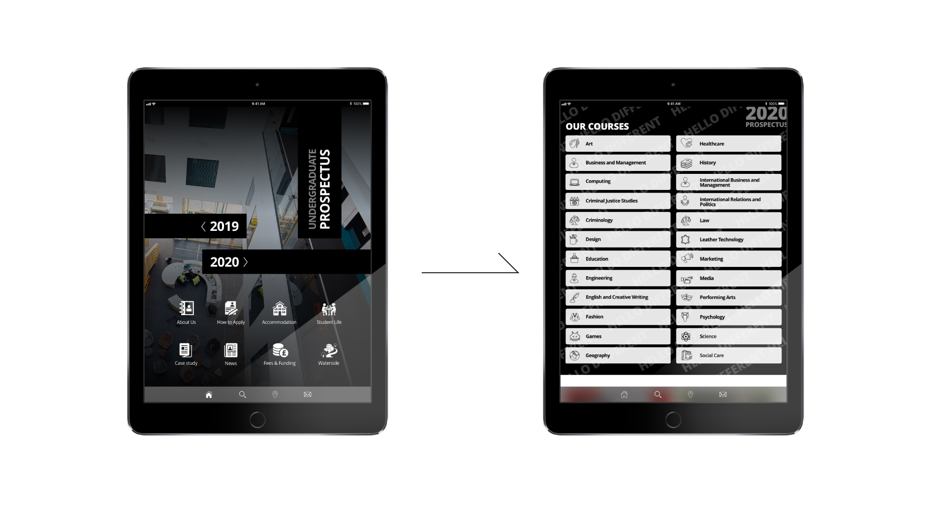
New Prospectus App: home-subjects list | Tablet view
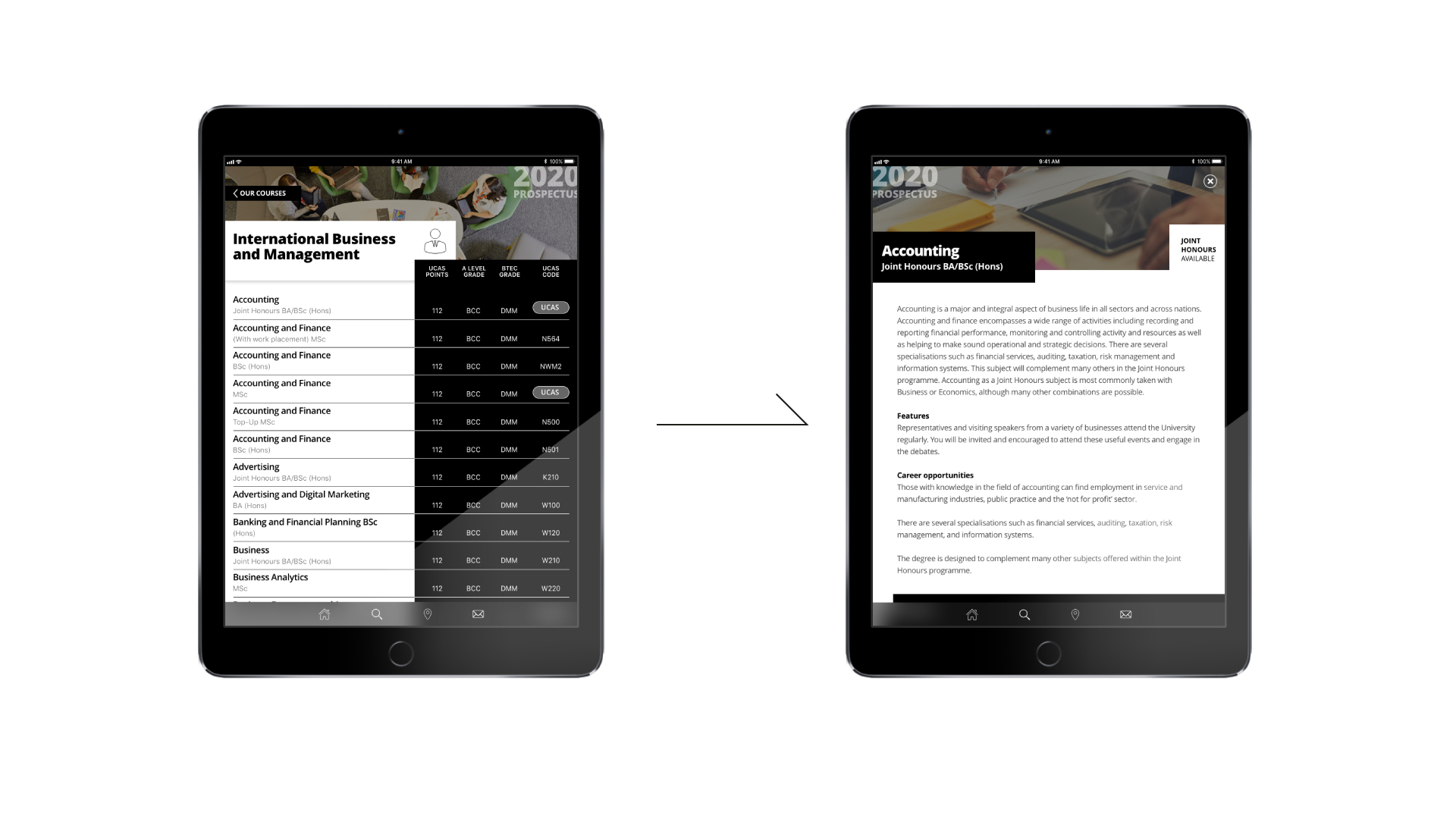
New Prospectus App: course list-course page | Tablet view
TESTING
We ran a usability pre-test session using the interactive mock-up, submitting it to 5 prospectus students, in order to reduce by 80-85% any usability issue. Results were very encouraging, highlighting only minor issues related to the predominantly black&white visual design.
My Role
As Design Lead I have been responsible for the product full lifecycle, from design to delivery. I provided user experience design, user interface design and visual design in order to make the product meet the business and user needs. I opted for an iterative approach, working closely with the developers and some students. I spent some time to review the old app, figuring out why it was not efficient, making sure the new one was totally user-centred.
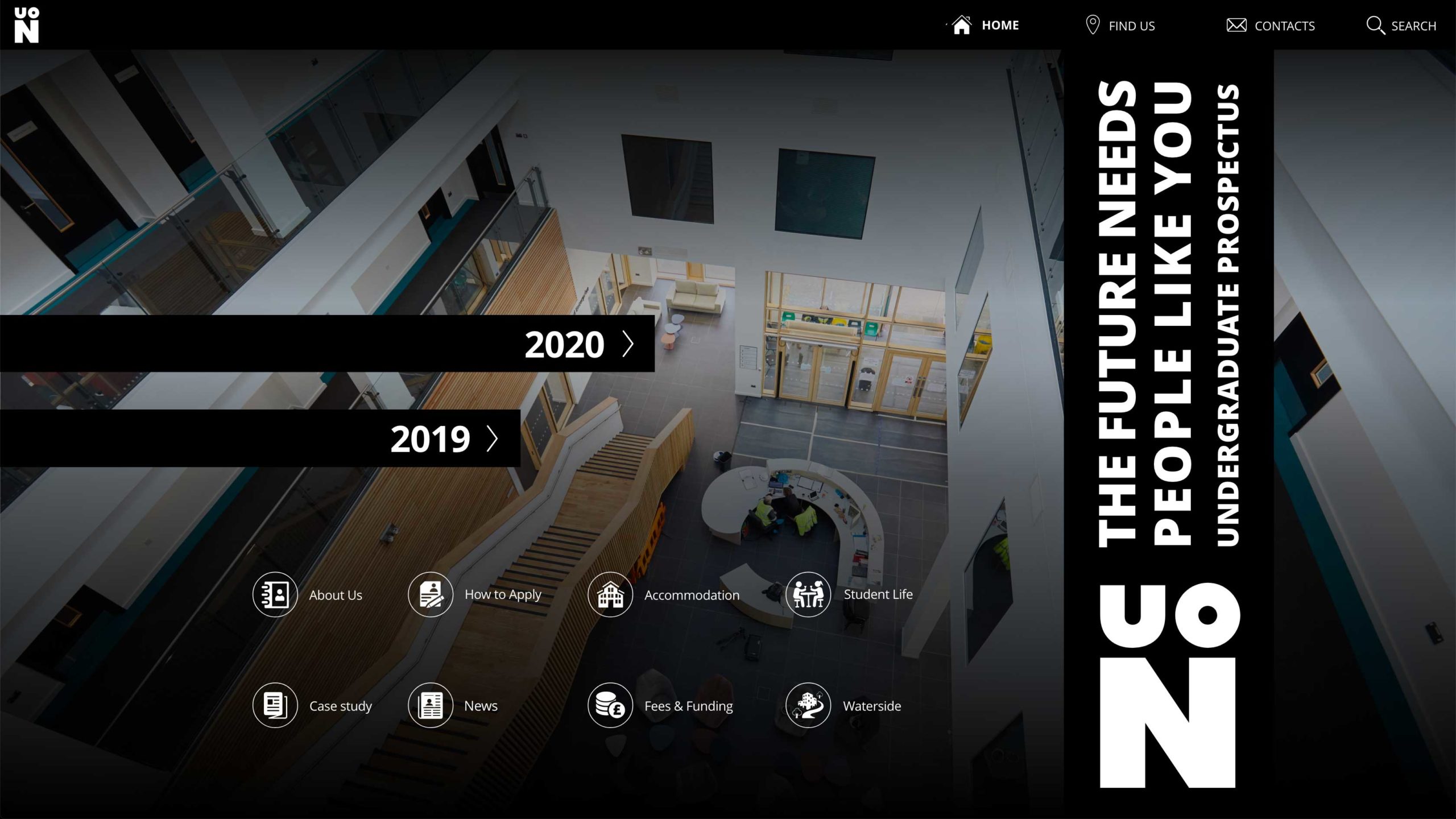
The Final Product
The final product, ready for deployment in 2020, will be a completely responsive app, downloadable form the Google Play Store and App Store for mobiles and tablets, or browsing its web version form the UON website. The rich visual aesthetic matches the graphics of the printed guide, providing a strong corporate identity.