Creative Design
Surf Language
Brand Identity
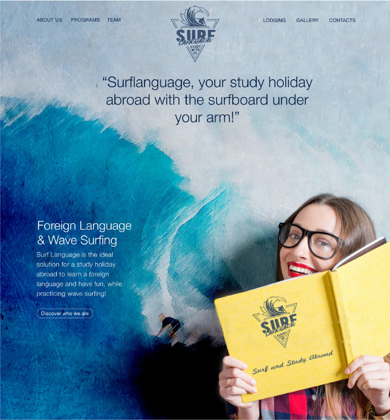
Surf Language is a new international company active in the areas of Culture-Sports-Tourism. They are specialised in Study Holidays Abroad & Wave Surfing. Their activities take place during the summer in Wales, Spain, France and Hawaii in suggestive ocean locations suitable for surfing. They offer holidays packages as two-week full immersion of study and surfing.
THE PROCESS
Challenge
As a new firm, I was tasked with crafting both the brand and website from the ground up. The cofounders envisioned a design that was not only minimalist and aligned with the surfing theme but also uniquely striking to stand out in a highly competitive market. My mission was to create a simple yet memorable brand identity and website that would captivate users and make a powerful impact amidst the noise.
Solution
LOGO
After consulting with the client and diving deep into surf culture, it became clear that the brand needed a vintage-inspired identity that resonated with its core audience – primarily young, adventurous students. Our goal was to create a symbol that not only captured the essence of the company but also blended the spirit of surfing with the pursuit of education, embodying both in a design that stands out and speaks to their lifestyle and values.
I sketched out a some ideas for the logo symbol, concentrating on a central symbol surrounded by text. I wanted to make it very vintage, including a hipster taste. I started using three main elements combined in different ways: surf board, waves and books. At the same time I tried to keep the logo design as minimal as possible and paired the symbol with two different typography: a clean sans serif and a handwriting.


WEBSITE
Due to the particular nature of the service provided it was not possible to conduct a competitors benchmark with similar websites.
Sector Benchmark
I started looking to surf school websites that provided training courses in order to get into the world of surf, understanding what kind of experience young people are looking for, the kind of imagery used, typography and other elements that could help me giving a start.
I studied and benchmarked six different surf school websites and identified some recurrent elements and patterns across all of them such as large use of full width images, cheerful colours, simple and flat information architectures.
Due to a very limited budget it was not possible to run any focus group or interviews with the targeted audience.
Nontheless, it was clear that we basically needed a simple brochure website that outlined the main and only product offered, giving to the potential customers an easy way to understand the offer, choosing it and getting in touch.
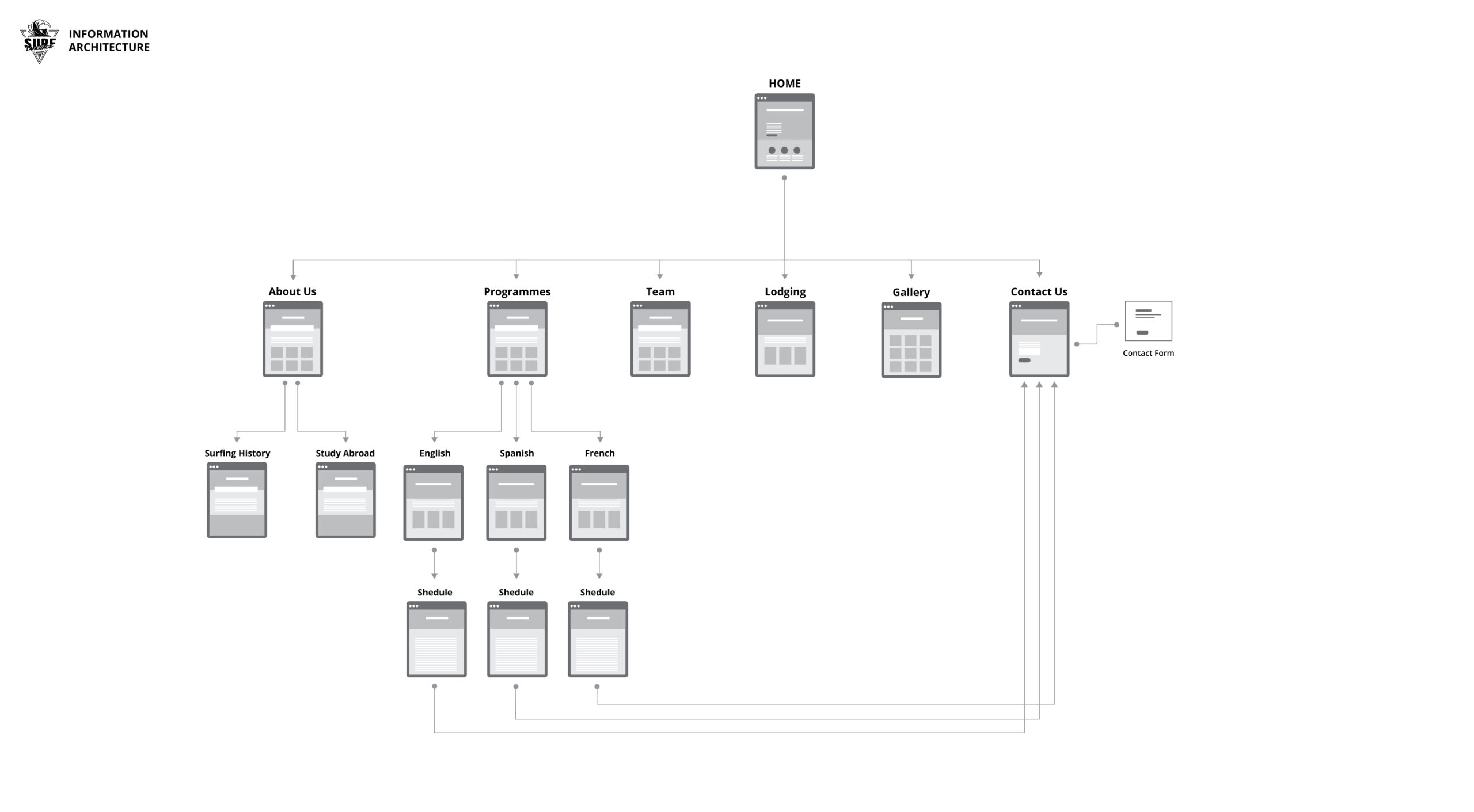
Information Architecture
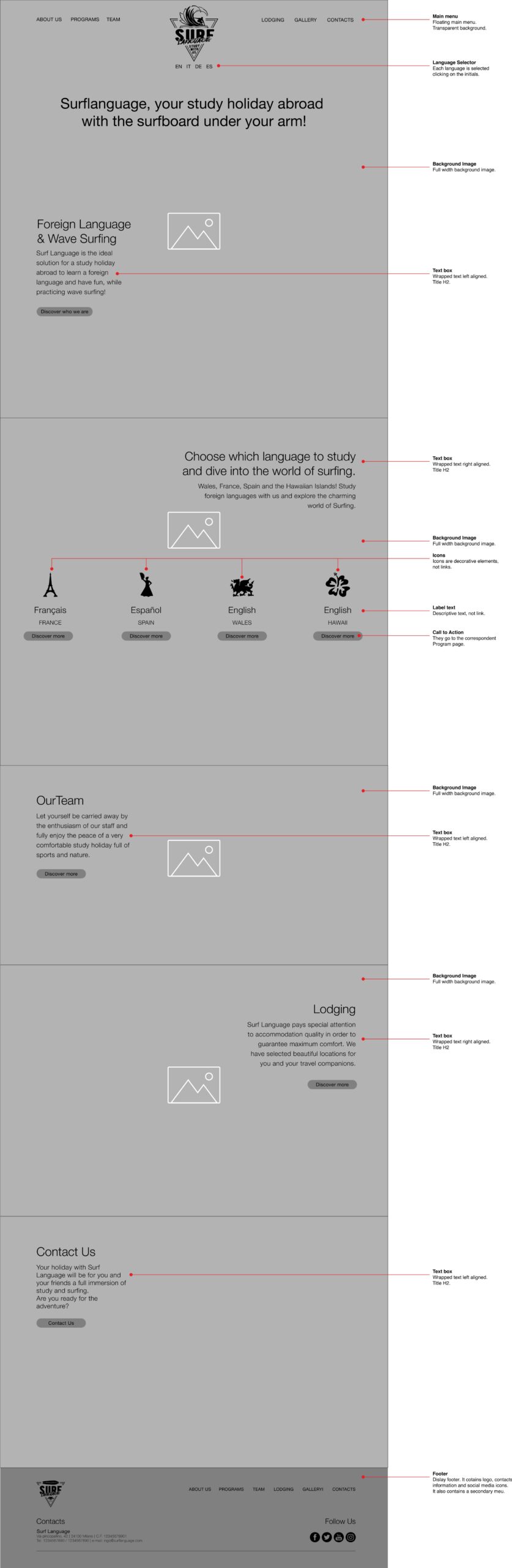
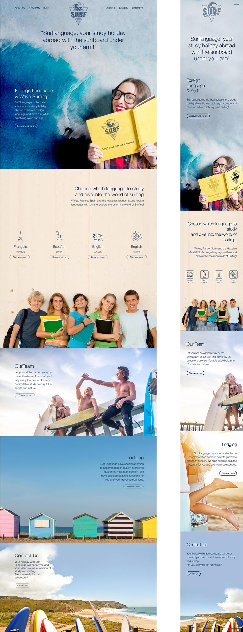
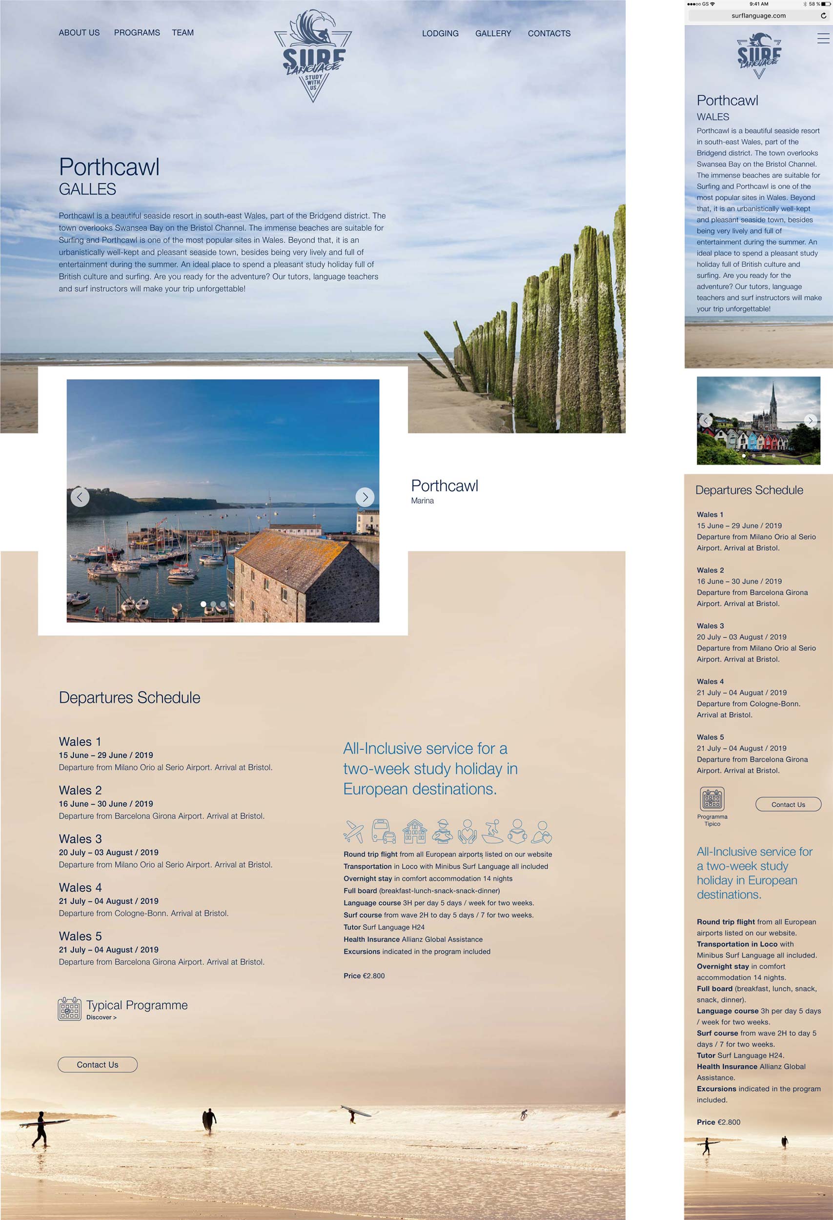
We decided to go with a simple Information Architecture, based on a home page broken up into six sections, listing all the services. Links in each sections lead to a specific subpage showing the related service.
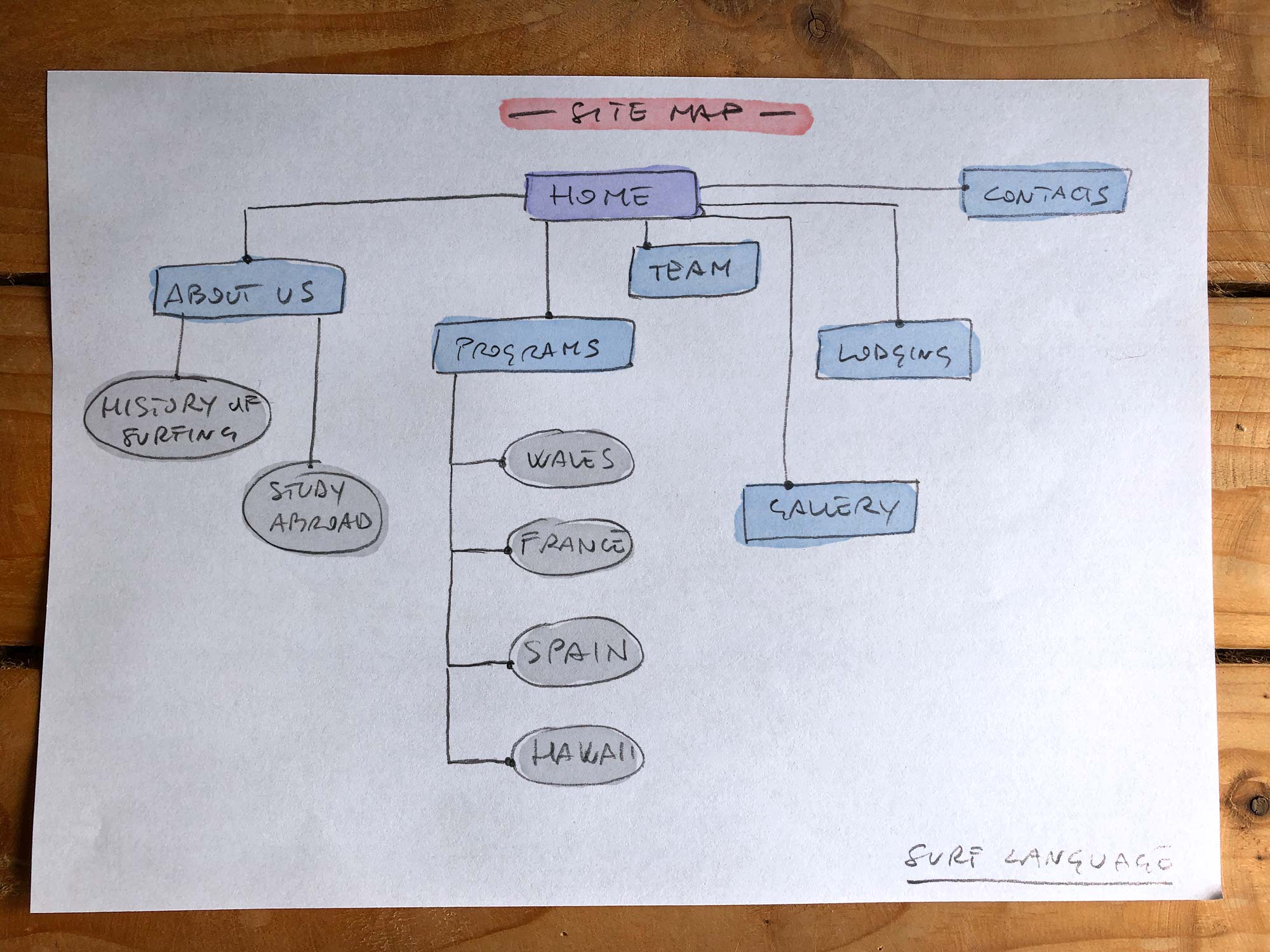
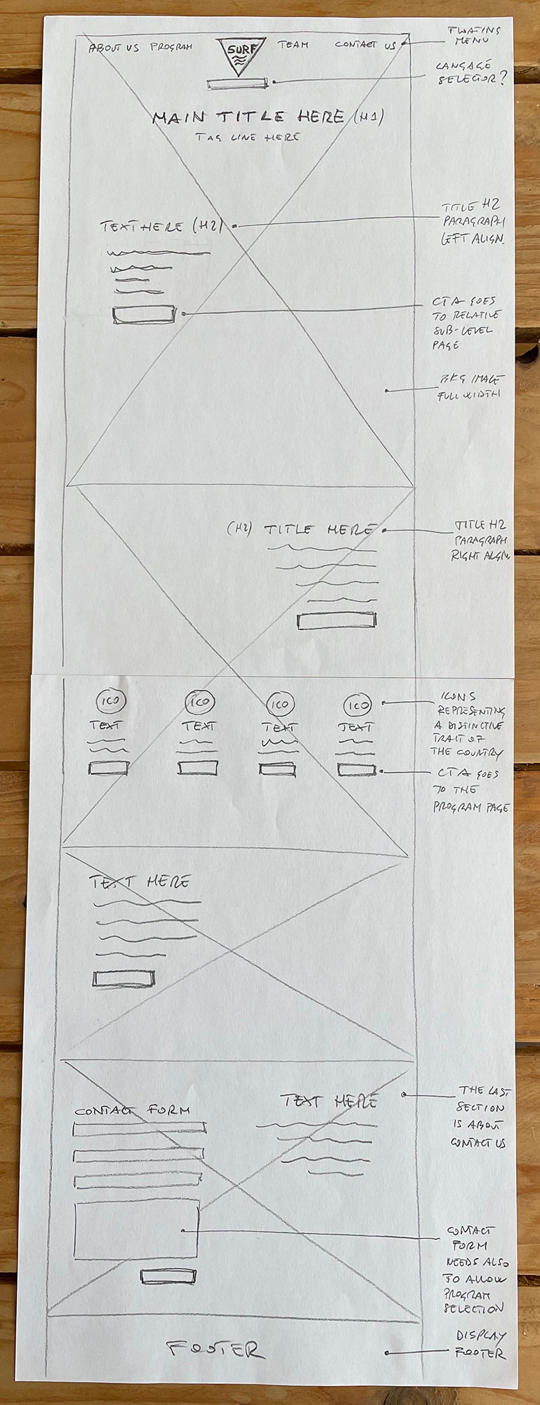
Sketches and Wireframes
I opted for a two-column fluid layout for each section, which stacked into a single-column layout on mobile. According to the sector benchmark, full width images were used as backgrounds and text wrapped in small paragraphs.
I sketched out wireframes for each section of the website to print out the basic elements, having a baseline to work from.
From the sketches to the wireframes the contact form in the Contact Us section at the bottom of the page has been removed, according to the client request of keeping the page as clean as possible.
Final Design
Because we based the user engagement on a very impacting imagery, I wanted to ensure a better user experience by responsive images, serving an appropriate-sized image to the user based on their device.
I asked the developer to implement the picture element (a standard W3C HTML), allowing to deliver an appropriate image to users depending on their device screen size and resolution.
My Role
I played the double role of UX/UI designer and Graphic designer. As UX designer I talked a lot with the cofounders in order to understand the business, the products and the goals. I took some time to put in place a quite extensive research of the competitors in the area to study their brands, understand the market, identifying any kind of brand and web standard within the sector.
The Final Product
The final product is an emotional and engaging video commercial, characterised by desaturated colours. The strong contrast between black backgrounds and the white helmet helps to emphasise the dramatic accent.