Brand | Website
Nekobukai Martial Arts Academy
Logo | Website
Nekobukai Martial Arts Academy is a well established reality with more than 40 years of experience in delivering martial arts courses. It hosts Aikido, Karate and Kung-Fu Shaolin schools based on the same value: Martial Art intended as a means for the improvement and evolution of the person.

THE PROCESS
Challenge
Nekobukai Martial Arts Academy asked for a complete rebranding, capable of providing the idea of a cohesive and consistent reality, while maintaining the specificity of each single discipline. This kind of specificity had to be portraied in the logo of each school.
Solution
BRANDING
I had to work on four different logos: the academy logo, and each single school logo.
I draw inspiration from each discipline tradition, symbolism and history. The tiger is the emblem of both Shaolin Wuseng style and Shotokan Karate style, while the circle is one of the main symbols for the Aikido school.
I experimented with different kind of tigers and circles, adding other elements specifically requested by the masters. The black and green conveys power to the Shaolin emblem, while red and white provide strength to the Karate symbol and vigor to the Aikido one.
The academy logo combines the elements of all emblems, with the tiger inserted into a circle surrounded by an hibiscus flower, symbol of welcoming and acceptance.
Black and white are the colours of the Tao, representing the two opposite forces yin and yang.
WEBSITE DESIGN
I started conducting some research, beginning with a benchmark of competitors in an area of 20km.
Competitive Benchmark
Six martial arts academies were selected. The analysis was conducted benchmarking five main pages: Home, Courses, Course Description, Instructors, Contacts.
Thank to this approach it was possible to identify core elements recurring across all competitors’ websites. It was also possible to highlight some conventions or standards about displayed information and pages where this information was placed.
Interviews
Following brief interviews with current students, it was clear they would have appreciated to learn detailed information about the school, tradition, philosophy, and training methods before applying or contacting the academy.
Dealing with students coming from three different martial arts, allowed me to build six personas, two for each discipline. This step was very helpful when it came to build the customer journey map.
Customer Journey Map
Thanks to the previous data collection, it was possible to identify a generic user journey that moves from the home page, through the school page to finally land into the course page where the user can find all the information needed to make an informed choice.
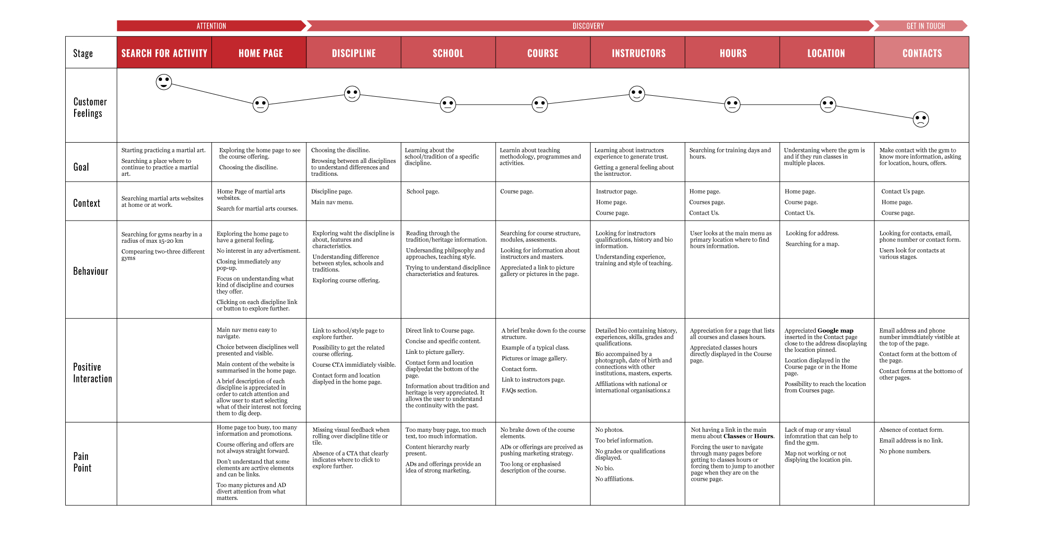
Research results allowed me to identify the most common user journey. I spent a lot of time talking with the owners, trying to understand differencies and communality between the three different kind of disciplines. The aim was to learn information about three different potential users.
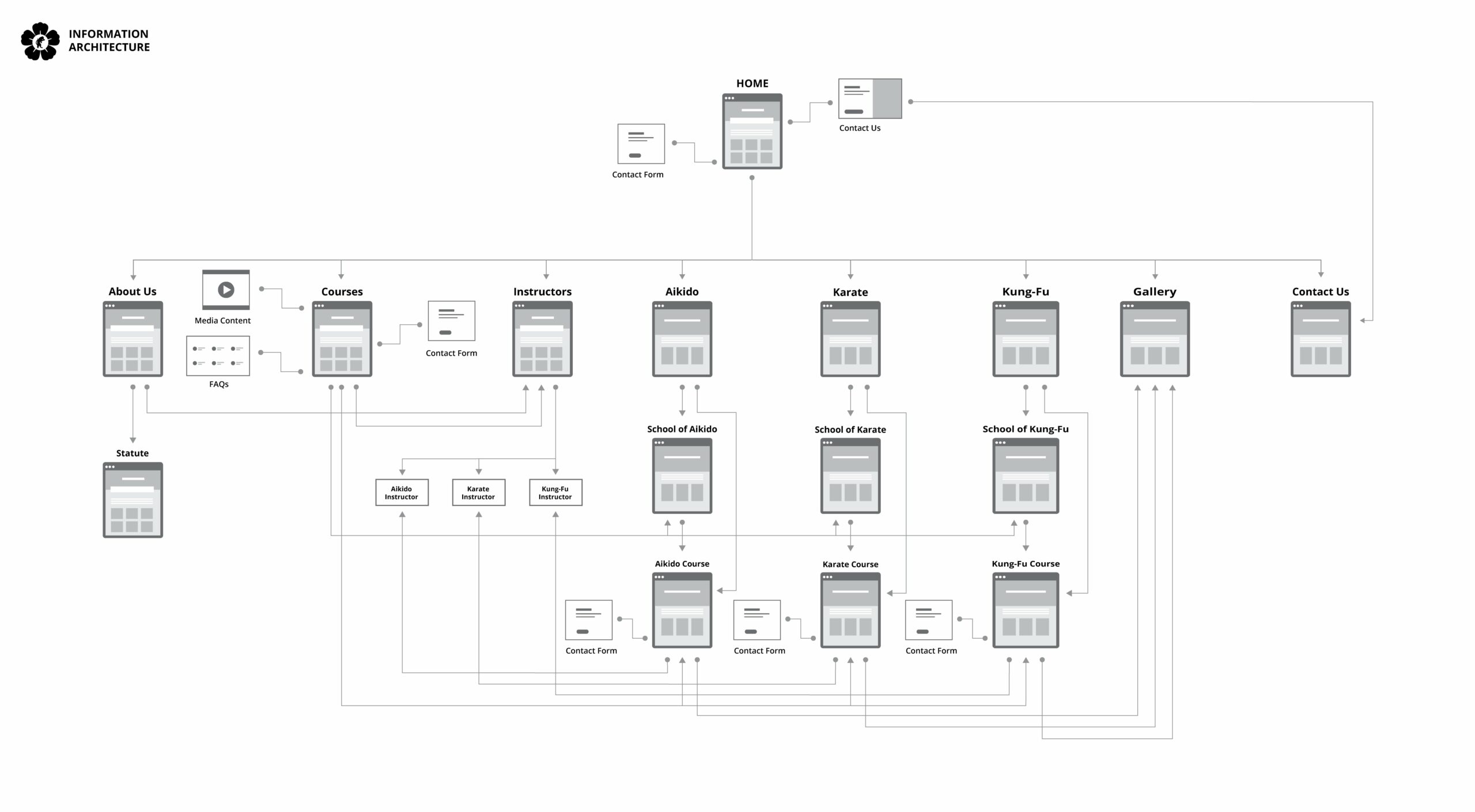
Information Architecture
According to the customer journey map, the sitemap could be quite small and simple, implementing only two sub-levels, making the website easily navigable, to provide the smoother user experience possible, leading the user through detailed information straight to the course page.
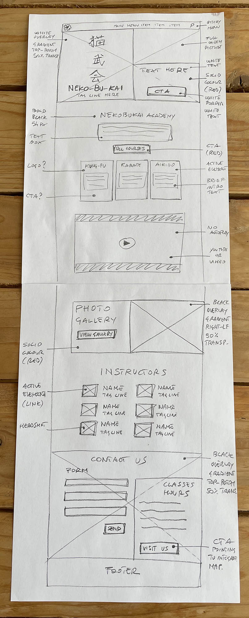
Sketches and Wireframes
I sketched out some initial concepts on paper, adding some notes on functionalities and appearance in order to discuss them with the owners, ensuring we were on the same page about layout and information hierarchy.
Then I moved into a more detailed wireframe for both desktop and mobile.
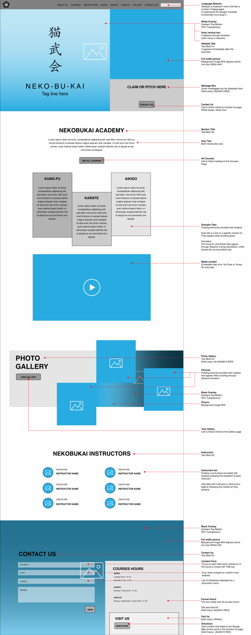
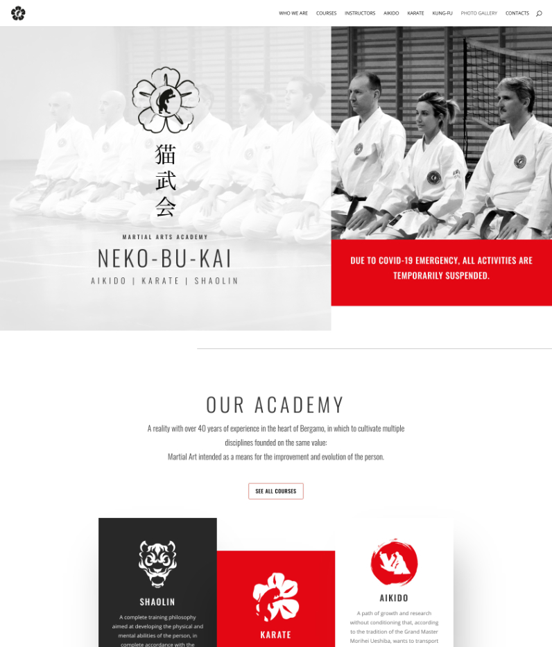
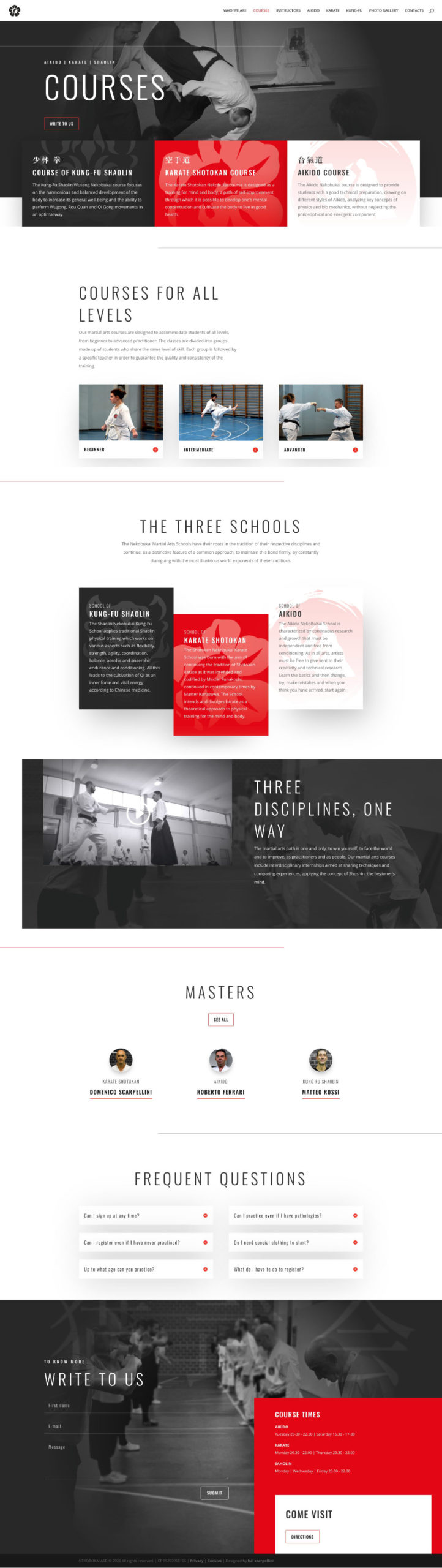
Final Design
Making everything handy, implementing a flat, minimalistic and user-centered design, was the winning choice to make a well established reality outstanding against the competitors.
Testing
A prototype of the website has been created and tested within a pool of five participants, enough to identify 80-85% of usability issues.
The test outlined some frictions when it came to specific affordances that required adding call to actions and visual nuances to make some functionalities more obvious.
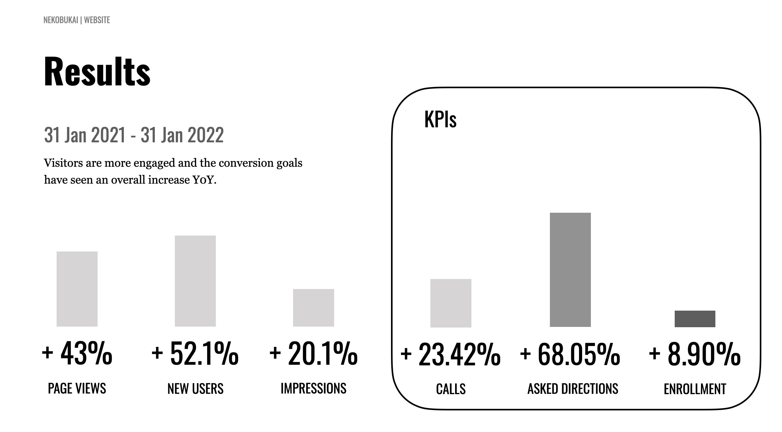
Results
Visitors have been more engaged and the conversion goals have seen an overall increase year on year, especially over the last year.
My Role
I played the role of UX/UI and Creative Designer.
As Creative Designer I curated the whole corporte identity, inlcuding logos, t-shirts, gym suits and website graphic elements.
As UX designer I took some time to put in place a quite extensive research of the competitors to understand the market, identifying any kind of brand, content and web standard within the sector.
The Final Product
The final product is a very eye catching website, characterised by contemporary and retrò design elements, that makes the balance between content and blank spaces one of the most distinctive elements of this kind of design.
Owners have been very pleased with the final result and the implemented design solutions have proven right considering the year on year good performance of the website.