Graphic Design
EPSON Emea
Fair Stand
Epson is one of the world’s largest manufacturers of computer printers and imaging-related equipment. In this particular occasion the EMEA branch took part to the Italian Textile Fair, the reference fair for high-end textile products and machinery. They displayed many fabric printing machines within a 400 sqm stand.

THE PROCESS
Challenge
Epson EMEA asked for the stand exterior panels and interiors elements to be provided with a very impactful visual design. The stand’s exterior graphics needed to be printed on high-quality fabric, leveraging Epson’s expertise in textile printing. The design had to be suitable for large-scale printing and installation.
Solution
BRIEFING
We went through many briefings before I could start working on some ideas.
They wanted to provide the idea of combination between natural fabric and ecologic inks with the concept of machinery. Epson logo and their partners’ have to be very visible.
They asked for an outstanding design, being this joint venture a great deal for all the contracting partners.
DESIGN
I started working on two different ideas, keeping the natural subject at the core of my design.
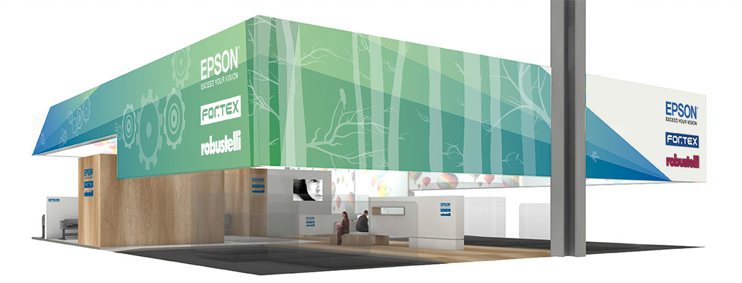
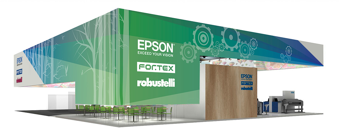
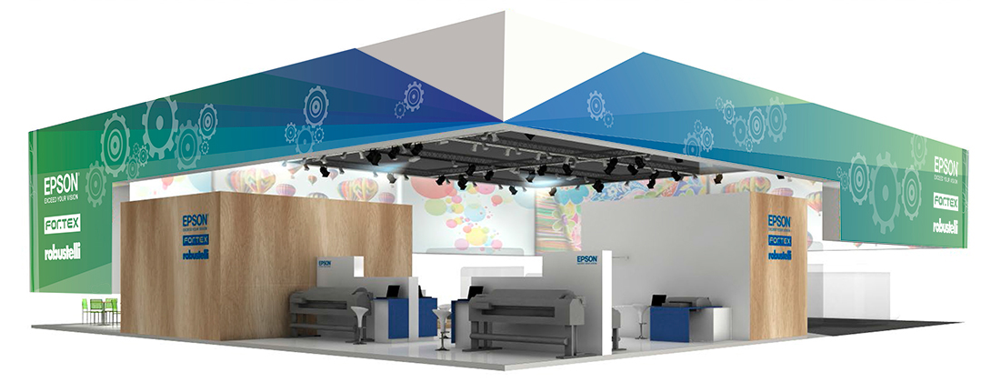
First Design Option
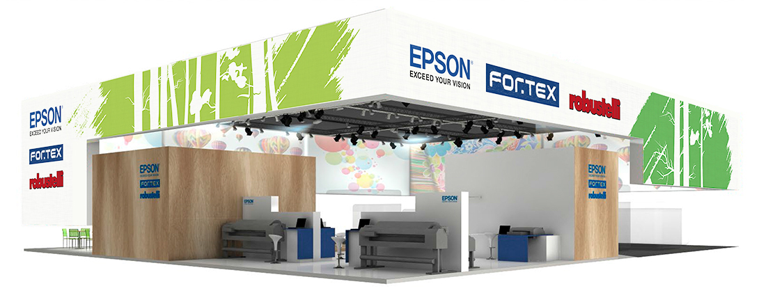
First option was about envisaging cogs and mechanical gears, typically seen in big weaving machines, combining them with natural elements like trees.
Using all four sides of the stand, I could easily distribute the design elements on the whole printable surface, grouping them. Being tall and narrow, trees generated a bottom-top visual movement, well contrasted by the horizontal structure of the stand.
I played with Epson brand colours, blue and green, in order to emphasise the natural and eco-friendly aspects.
StandEpsonMockup1
StandEpsonMockup3
StandEpsonMockup4
StandEpsonMockup2
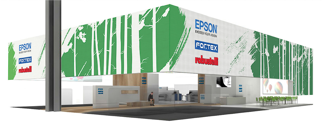
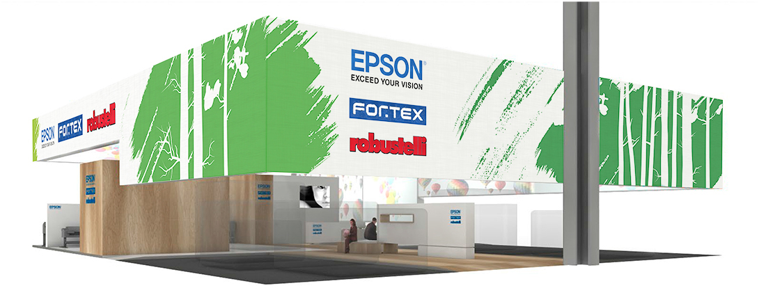
Second Design Option
The second idea I worked on had the natural aspect at its core. I eliminated gears and cogs to concentrate on colours and trees.
The effect I was looking for was giving the impression that, beneath the white surface of a sterile machinery, there was a green and natural core.
I used the brushstrokes to uncover the underneath vibrant shades of green.
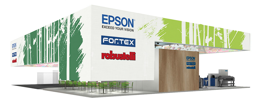
Final Design
The management was happy with the two options provided, opting for the second one.
Few days before sending the whole project to print, and after several hours discussing with the printers to get the best result, the client asked for a radical change.
After so much work, I had to start from scratch.
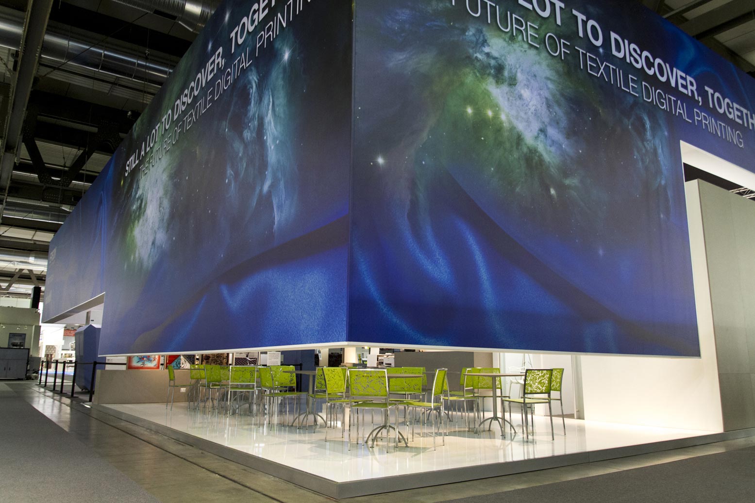
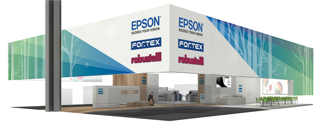
I had to think about something quick that incorporated Epson’s brand colours, aligning with its global brand identity, conveying innovation, sophistication, and reliability. I thought about the idea of fabric unveiling and revealing cosmic imagery, symbolizing the depth and potential of EPSON’s technology. The concept should emphasise discovery, and the expansive possibilities offered by EPSON’s solutions.The design also highlighted Epson’s motto “There’s still a lot to discover”.


My Role
As lead designer I managed all the stages of design leading it through to delivery. I discussed any creative choice with Epson EMEA management in order to have any step signed off. I also provided consultation for the graphic design of rolls-ups, prints and other stand components.
The Final Product
The final product is a very outstanding fair stand, that cannot go unnoticed. It delivers a very strong and visual impact that highlights the prestige of a world leading brand.