Native App
Catholic University of the Sacred Heart
M.E.S.C.
Catholic University of the Sacred Heart is an Italian research university founded in 1921 and linked to the Agostino Gemelli University Polyclinic. It is worldwide renowned for its faculty of Law and it has been granted five stars by QS Stars, a global university rating system, in the following fields: employability, teaching, facilities and engagement.
THE PROCESS
Challenge
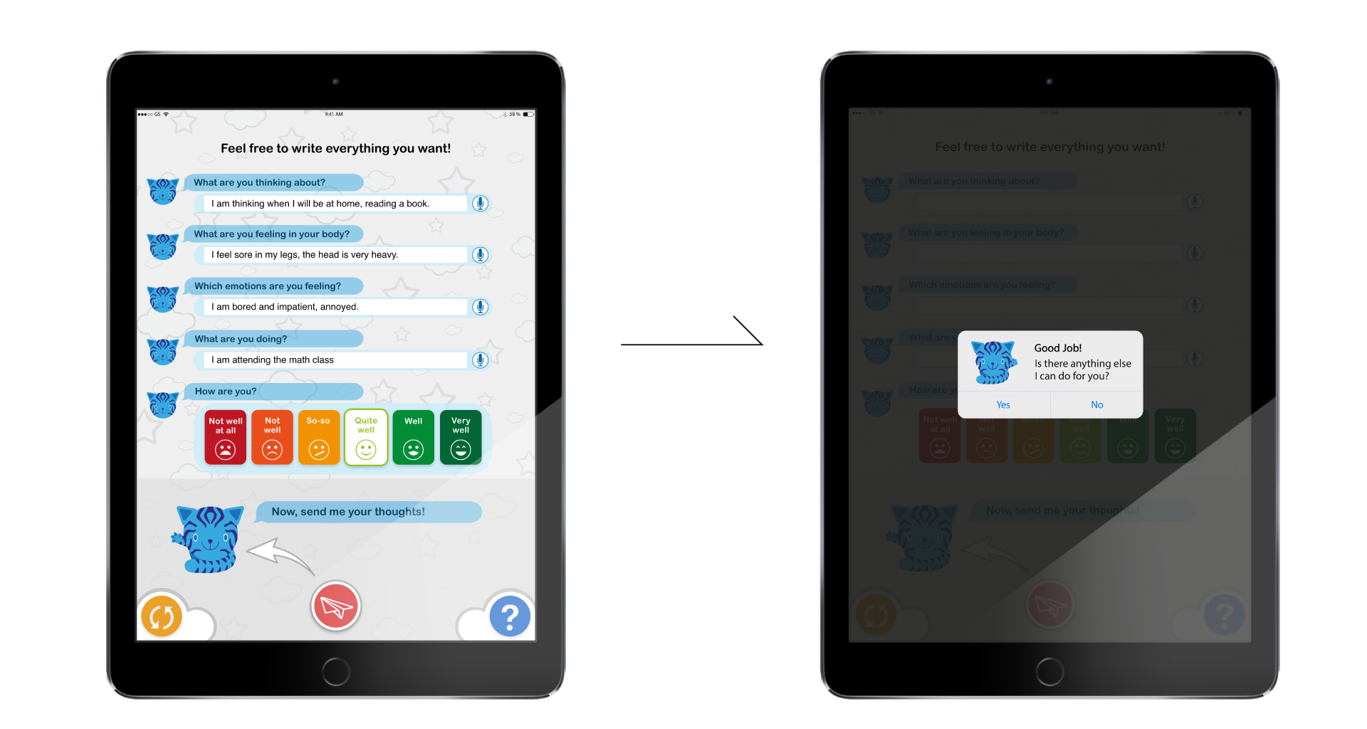
UniCat researcher asked me to create an App to monitor children’s feelings, emotions and thoughts during the day, while supporting their awareness and wellbeing.
The real challenge was to build an App featuring a child oriented user interface, simple and effective user experience and local data storage.
Solution
APPROACH
After sessions of brainstorming with the principal investigator, it was not possible to proceed with a normal research phase, due to the ethic committee’s request of having as less impact as possible on children.
For this reason I had to base my work on a more predictive approach in the beginning, using the final testing phase as the only opportunity to test the App.
RESEARCH
I did some research into children apps design, even if this specific App would be something completely different, with no apparent engagement for children.
It was clear that children use apps in a very different way and the UI is also peculiar:
- Simple layout
- Eye-catching visual elements
- Few texts
- Reduced number of flows
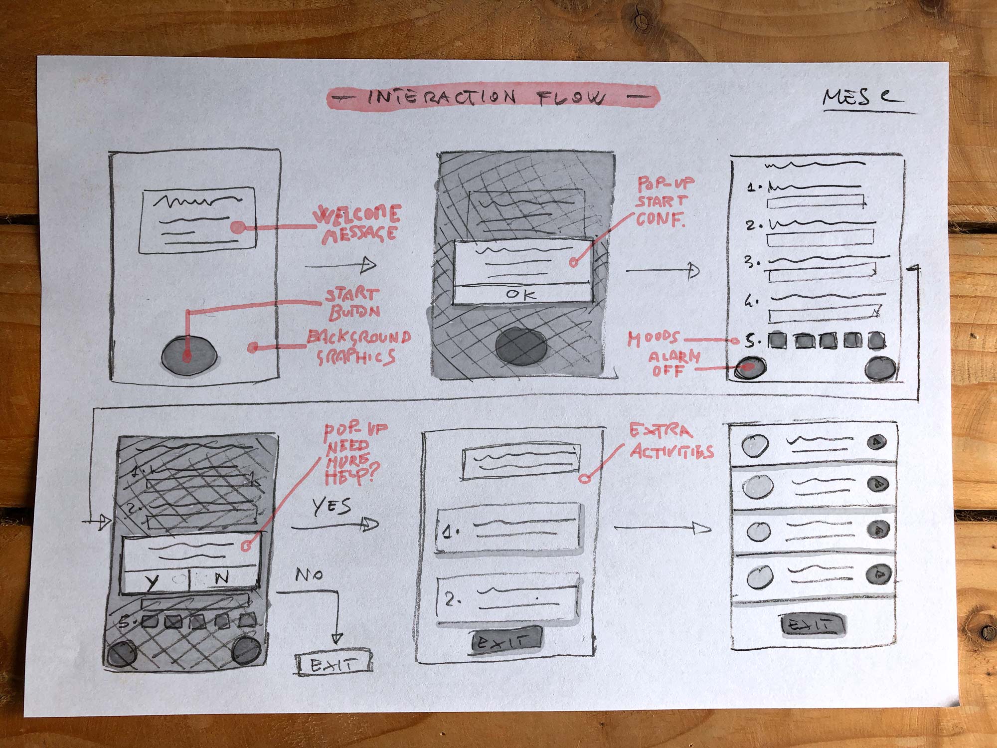
INFORMATION ARCHITECTURE AND FLOWS
Supported by the principal investigator I sketched out a very simple IA and some examples of possible interaction flows, and opted for a minimal eye-catching layout.
Considering that children might easily be distracted by too many stimuli, I tried to focus their attention on big buttons with self esplicative icons.
DESIGN
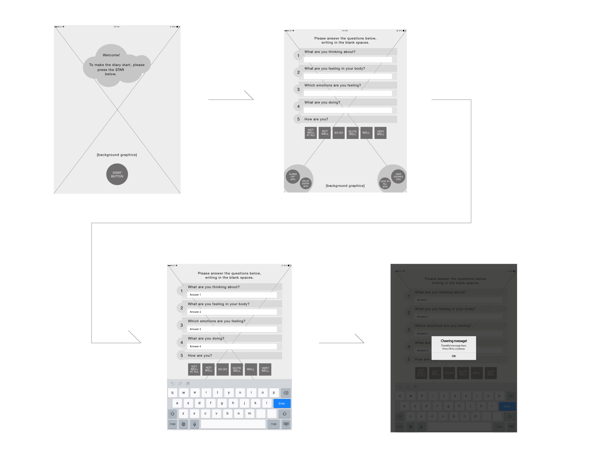
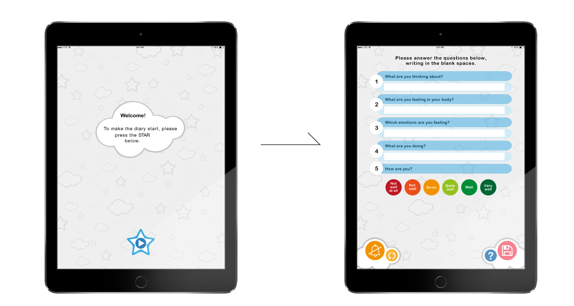
After the layout and the interaction flows were signed off, I moved the wireframes into a hi-fi mockup.
According to what emerged from researching into children apps, I tried to think like one of them, focusing on graphic elements, with minimal verbal instructions.
This approach ended up with few functions and big coloured buttons provided with very clear icons.
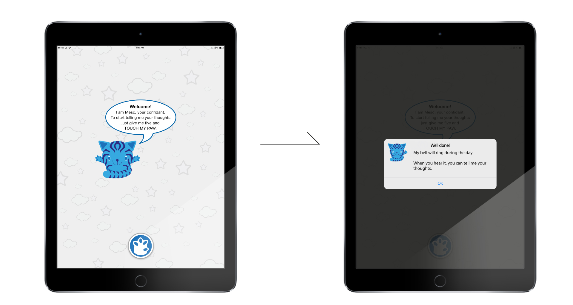
Children needed to have their attention engaged, so we decided that an acoustic signal would have been a good solution to attract their attention, reminding them to fill in their answers.
We opted to pre-install the App on a number of devices the University provided to the selected children, collecting data after one week of usage in a completely anonymous way.
TESTING
Despite reluctance form the ethic committee, I managed to convince them and the principal investigator that this was a very paramount step in our journey to make the App work.
The App was tested by 23 children (aged 7-11) for one week, in order to ensure that there were no major usability issues. Children were then briefly interviewed to highlight any difficulty and collect their suggestions, before submitting the App to 400 children.
Feedback Analysis
Children didn’t find any particular issue using the App or navigating through screens. Everything seemed ok from a usability perspective, however they were very poorly engaged.
The principal investigator was worried that a low engagment would result in a scarse and poor data entry.
At that point I proposed to observe them using the App, in order to better understand what we could do to increase the engagement.
Surprisingly children behaved in a peculiar way when interacting with the App. They answered the questions addressing the App as an individual, like in a sort of conversation with a friend or a puppy.
FINAL DESIGN
Children’s behaviour was an enlightening discovery that gave us the chance to tailor the user experience and definitively increase the engagement, building a more user-centred App.
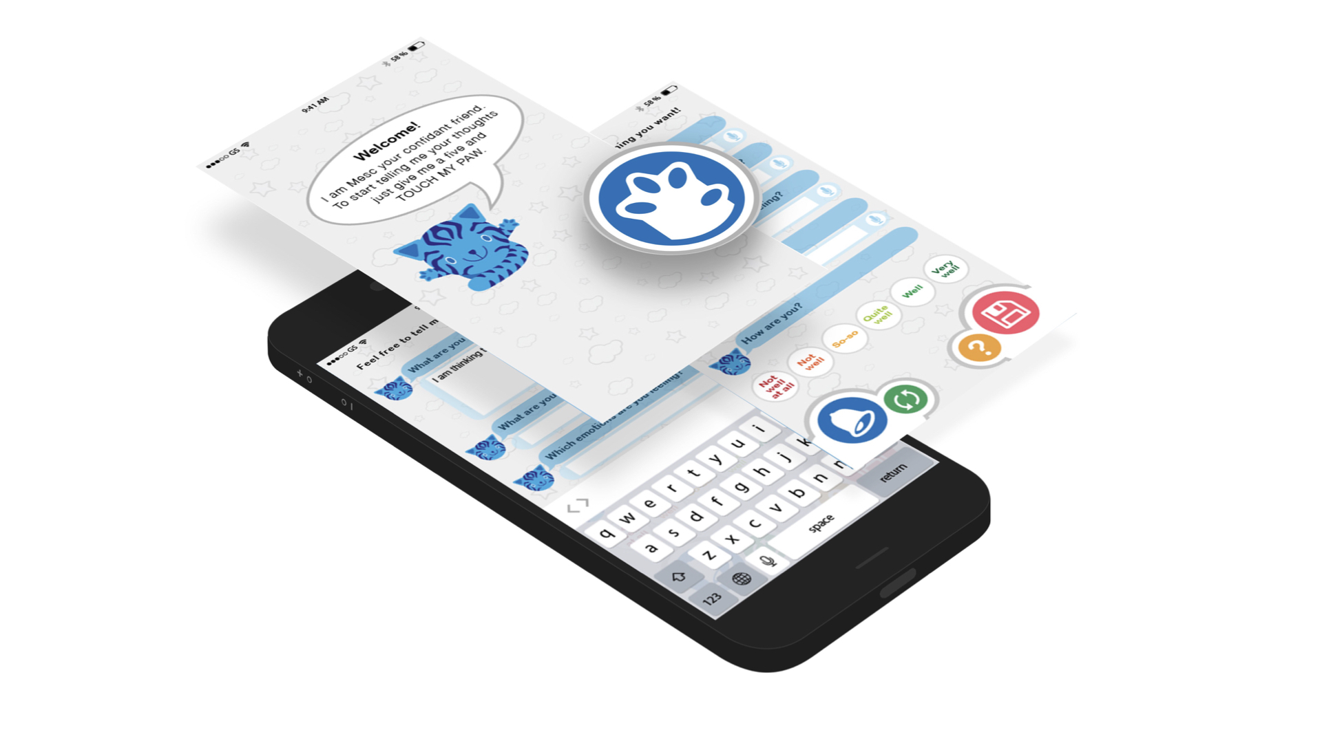
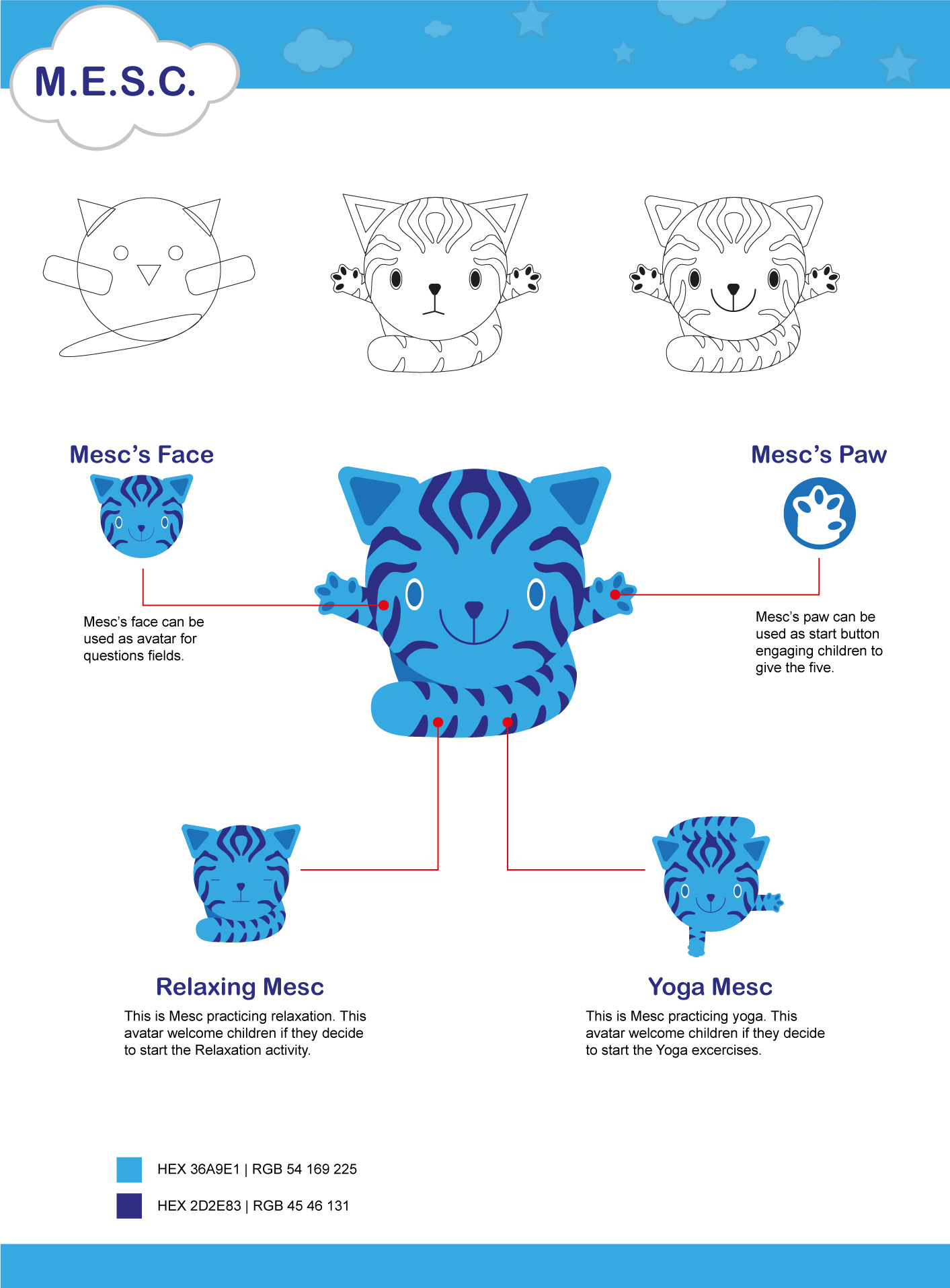
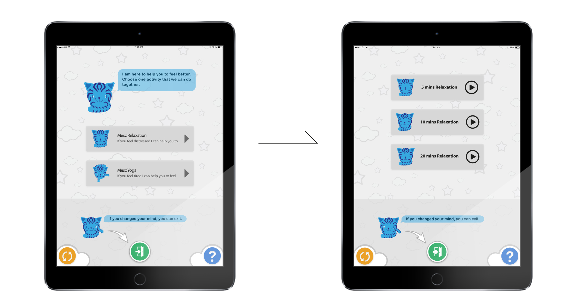
In order to implement these aspects, M.E.S.C. (Mindfulness Experience Sampling for Children) became a fictional character named Mesc.
We ran a quick survey amongst the 23 children in order to understand what aspect they would expect Mesc might have. It turned out to be a friendly blue cat interested in children’s daily life and happy to help them.
RESULTS
The implementation of Mesc as a character was a win-win implementation.
Childern felt engaged and happy to share their experiences with someone that could listen. They were well inclined to share more detailed information.
The App has been submitted to 400 children and the data entry was around 93% completion with a very good level of accuracy.
The principal investigator was more than happy to collect so much detailed data.
My Role
As Lead Designer I have been responsible for building the user experience, the user interface and the visual design. I managed the full product lifecycle to ensure customer and user’s needs were met. I set an iterative approach to rapidly incorporate children’s feedbacks into the designs.
The Final Product
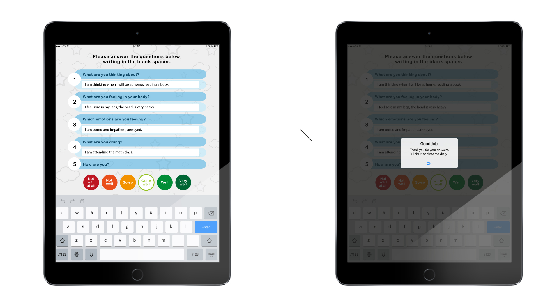
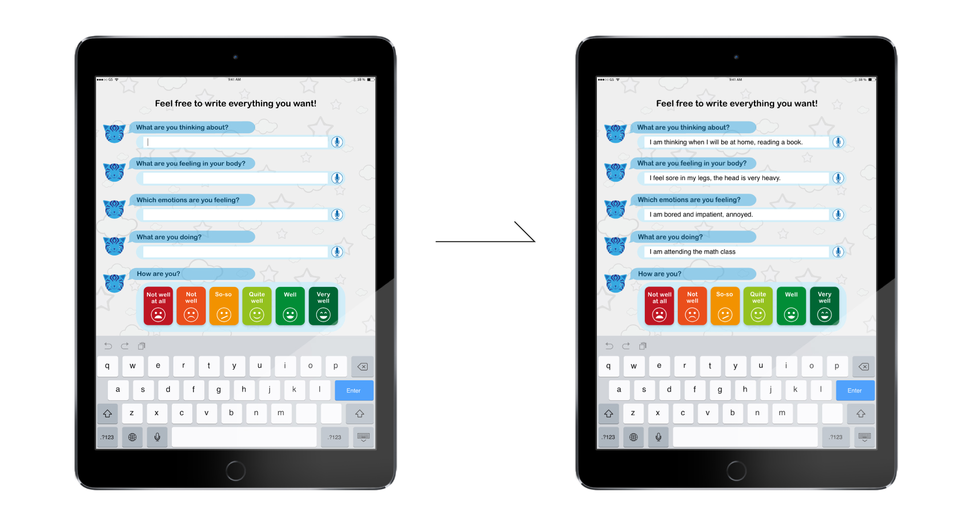
The final product is an App designed to ask children to complete items related to their thoughts, emotions, and bodily sensations on the device five times per day for five days, in addition to describing the situations in which they were living.
The MES-C gave five acoustic signals from 8 a.m. to 8 p.m. at randomised time points to prevent participants from anticipating their answers.
If the children did not start their report within five minutes, the signal turned off, then resumed after about 20 minutes.