Website
University of Northampton
PUBLIC WEBSITE
The University of Northampton (UON) is one of the youngest universities in the UK, but is one of the few universities to be ranked Gold in the Teaching Excellence Framework (TEF).
They have won multiple awards for their work in the area of social impact, being the first university in the UK to be named as Changemaker Campus in 2012.
THE CHALLENGE
total revamp
UON asked for a complete rebrand of the public website to make it consistent with the changed corporate identity.
A new desgin was needed.
Something capable of addressing the outdated look and feel, increasing conversions and fixing user journeys amongst other problems.
The overall user experience of a 5000-page-website had to change, to improve, in other words to be more user centred. And it had to be done quickly.
the Solution
analysis
I started reviewing the old website in order to understand what was working and what was causing friction potentially generating frustration in the user.
According to the YoY report the SEO agency provided, the overall performance of the website was not great:
%
Page Views
%
Sessions
%
Avg. Session Duration
%
Bouncing Rate
I had multiple meetings with the management in order to clearly understand goals, addressing business needs and pain points:
Business Needs
Refresh outdated design
Address different audiences
Accessibility requirements
Increase conversions
Pain Points
Poor quality of content
Poor user journeys
Bouncing rate
Accessibility issues
research
I started looking at UON competitors in order to identify any convention, sector standards, specific use of affordances, layouts or typical information architectures.
Competitors Benchmark
I analysed the 6 main UK competitors’ websites plus other 9 universities websites (3 top, 3 middle, 3 bottom of the League Table ranking), focusing on specific pages, benchmarking a total of 150 pages.
It was possible to identify 5 common patterns about page layout and information architecture.
Direct competitors
Panges analysed
RANKING COMPETITORS
common patterns


Focus Group and Interviews
We arranged two focus groups with a total of 23 students (first and second year, and prospectus students).
This helped me to determine user’s needs and typical areas of friction, such as specific user journeys, providing a deeper understanding of user’s expectations and gather more qualitative data about their experience navigating universities websites.
We managed to identify 5 different Identikits, narrowing them down after some discussions.
At the end of the process we have been able to build 3 Personas.
23 Students
3 Personas
Information Architecture
After collecting and analysing all the research data, it was time to review the Information Architecture.
Following user’s needs/expectations and competitors benchmark, the Content Team and I started to redesign the IA of the website.
Compared to competitors’, the IA of the old website was very different, presenting more sub-levels and relevant content buried down into the structure, making difficult for the user to reach it straight away.
We rearranged the whole content in 6 macro areas, simplifying the sitemap, reducing complexity and number of sub-levels.
We managed to further reduce the complexity in a second review, narrowing down the whole structure to 5 macro areas:
Study
The core area of the website.
The most navigated section, containing more than 300 courses.
Student Life
The most important area for current students.
About Us
The area containing the identity of the university.
Research
A section that highlights of UON social impact.
Community
Every other information about activities.
This further simplification matched competitros’ structure, providing the user with more common and expected patterns.
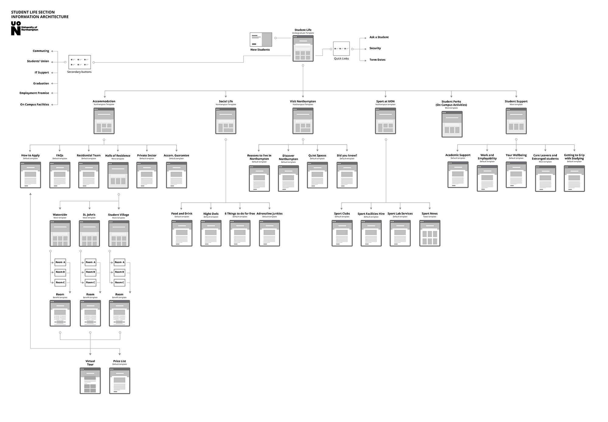
Student Life Section | Information Architecture
Information Architecture
Home Page Sketch | Desktop

Home Page Sketch | Mobile
DESIGN
The old website was built on WordPress and the management wanted to keep it, supporting the most popular widespread devices. The aim for using WordPress was also to allow content editors to upload information very quickly, without going through developers every single time.
According to the benchmark and to users’ feedbacks, it was clear that we needed many specific templates to accommodate different type of content and user journey.
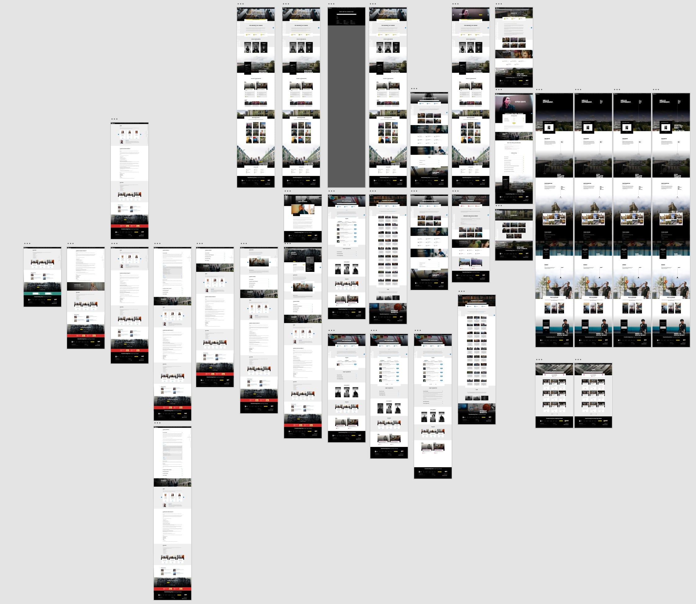
I created 18 templates that could be used by the content editors to create new pages or update the old ones.
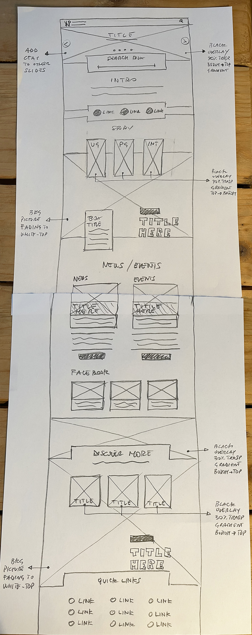
Sketching
I started sketching on paper the layout of all templates, both mobile and desktop in order to check the correct positioning of each single UI element.
Home Page Sketch | Desktop
Home Page Sketch | Mobile
Wireframing
I opted for a minimal design with a stronger visual impact, based on large use of pictures and geometric shapes. I implemented a simple and intuitive layout in order to provide the most enjoyable experience for the user. I also included SEO best practices when it came to display content.
I have also applied standard conventions for the main navigation menu, call to actions and other interactive elements, integrating the W3C Accessibility Guidelines.
Modularity is what makes the difference.
The templates are built with sections that can be switched on/off as needed, providing the possibility to customise a single template according to the content.
There are 13 modular templates that provide more flexibility and allow content editors to adapt the layout when they have to meet specific needs.
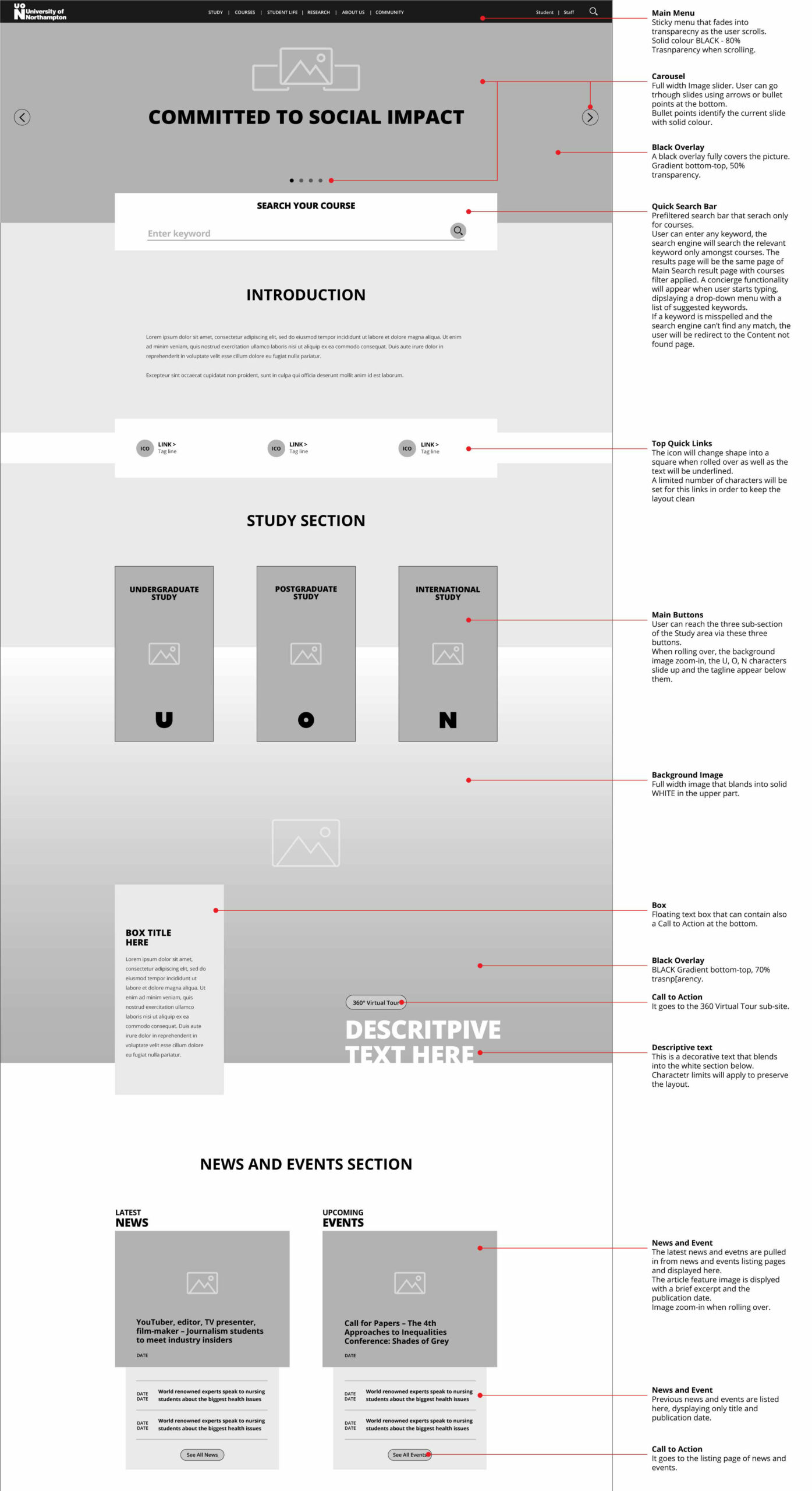
Home Page First Section | Wireframe
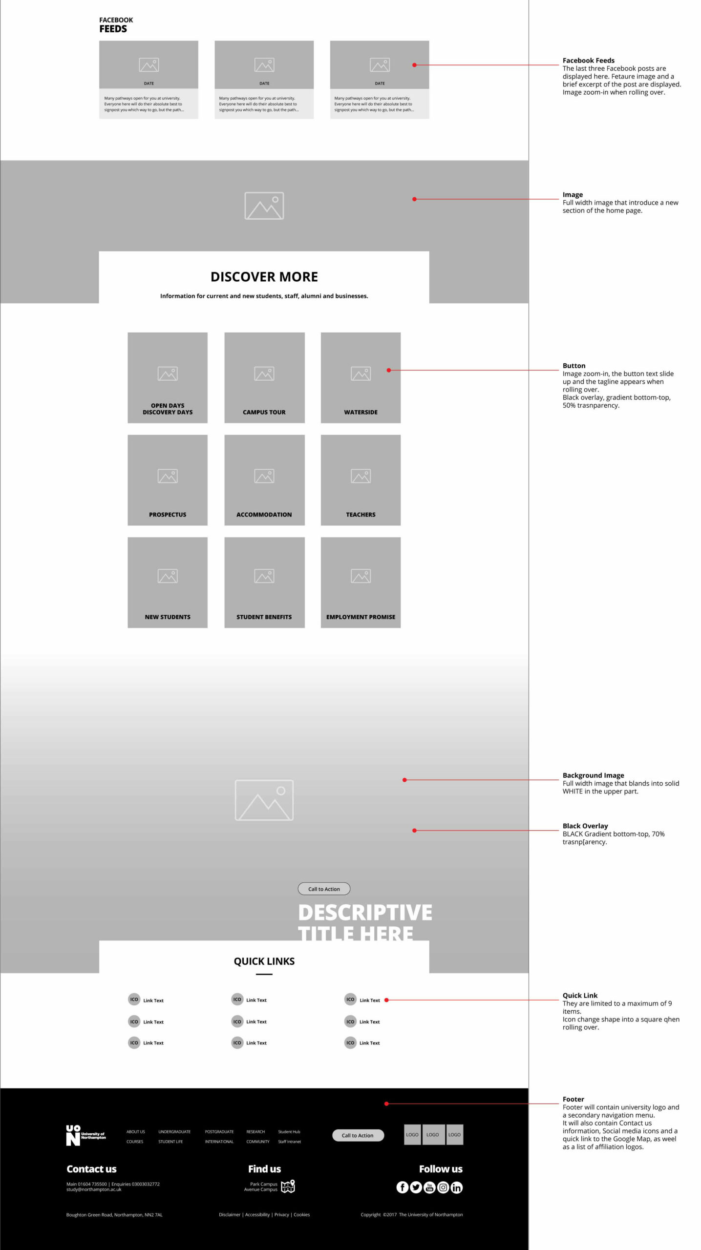
Home Page Second Section | Wireframe
First Iteration
When I presented the wireframes to the management, new needs came from three different teams.
- Brand asked for adapting some elements to the new Undergraduate Campaign and for the implementation of the new 360 Virtual Tour.
- Student Recruitment asked for finding a way to advertise stuent perks and to increase the focus on the new campus.
- Events highlighted the necessity of incrising the visibility for Postgraeduate events.
I had to review some templates and apply changes in order to integrate the emerging business needs into the overall user experience.
After discussing the changes with developers, making sure that every new element and functionality were implementable, I started to redesign specific sections of some templates to accomodate the business requests.
User Interface
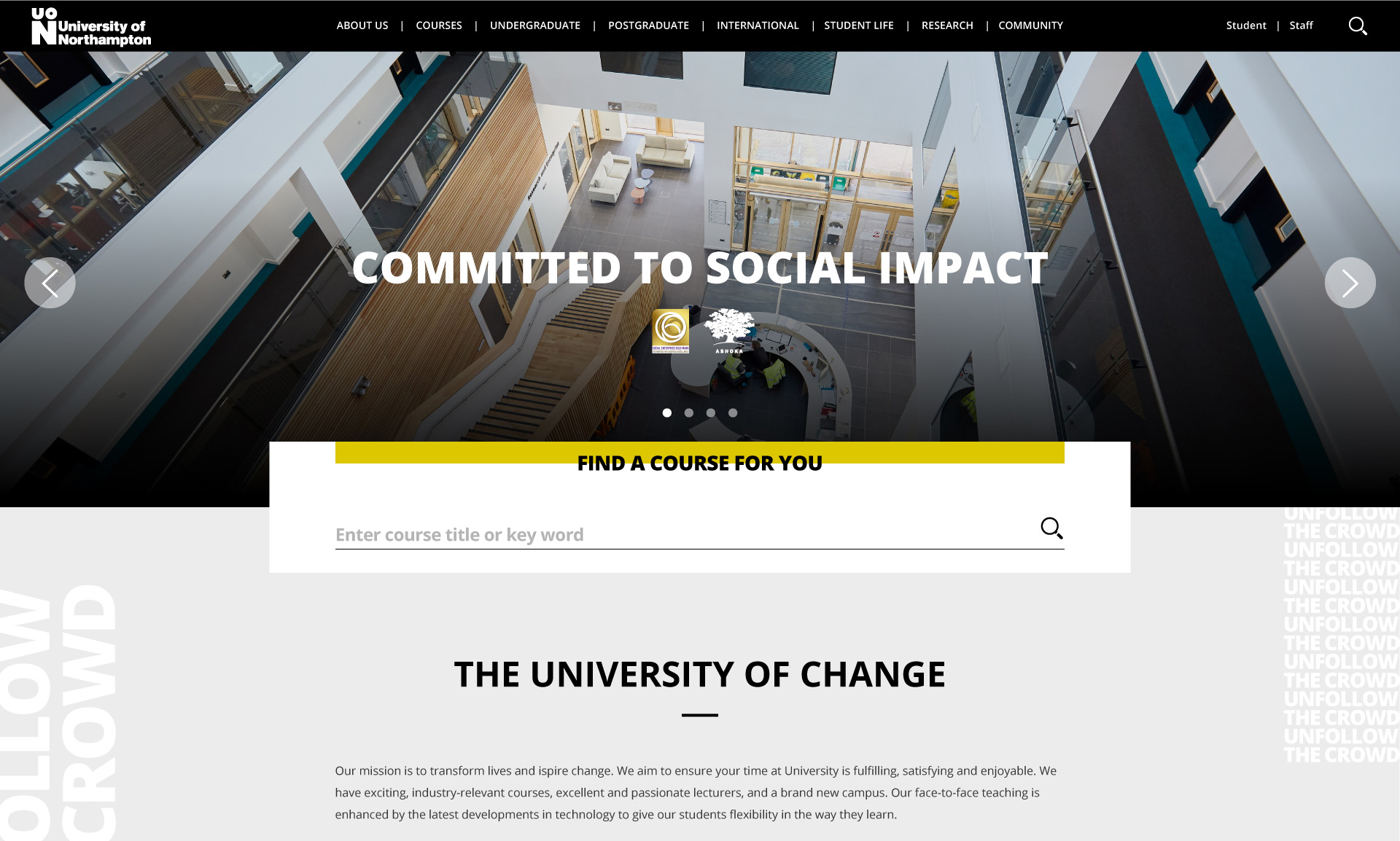
According to the marketing campaign strategy, the aesthetic had to be minimal with a strong focus on content, typography, cool imagery and black/white colour combination.
Now it was a matter of experimenting with black and white combinations, adding some drops of colours to highlight active links or specific areas, applying black overlays on full-width images.
Each UI element was designed and thought in accordance to the Brand Guidelines. Pictures, videos and graphic elements were intended as the best way to deliver remarkable information.
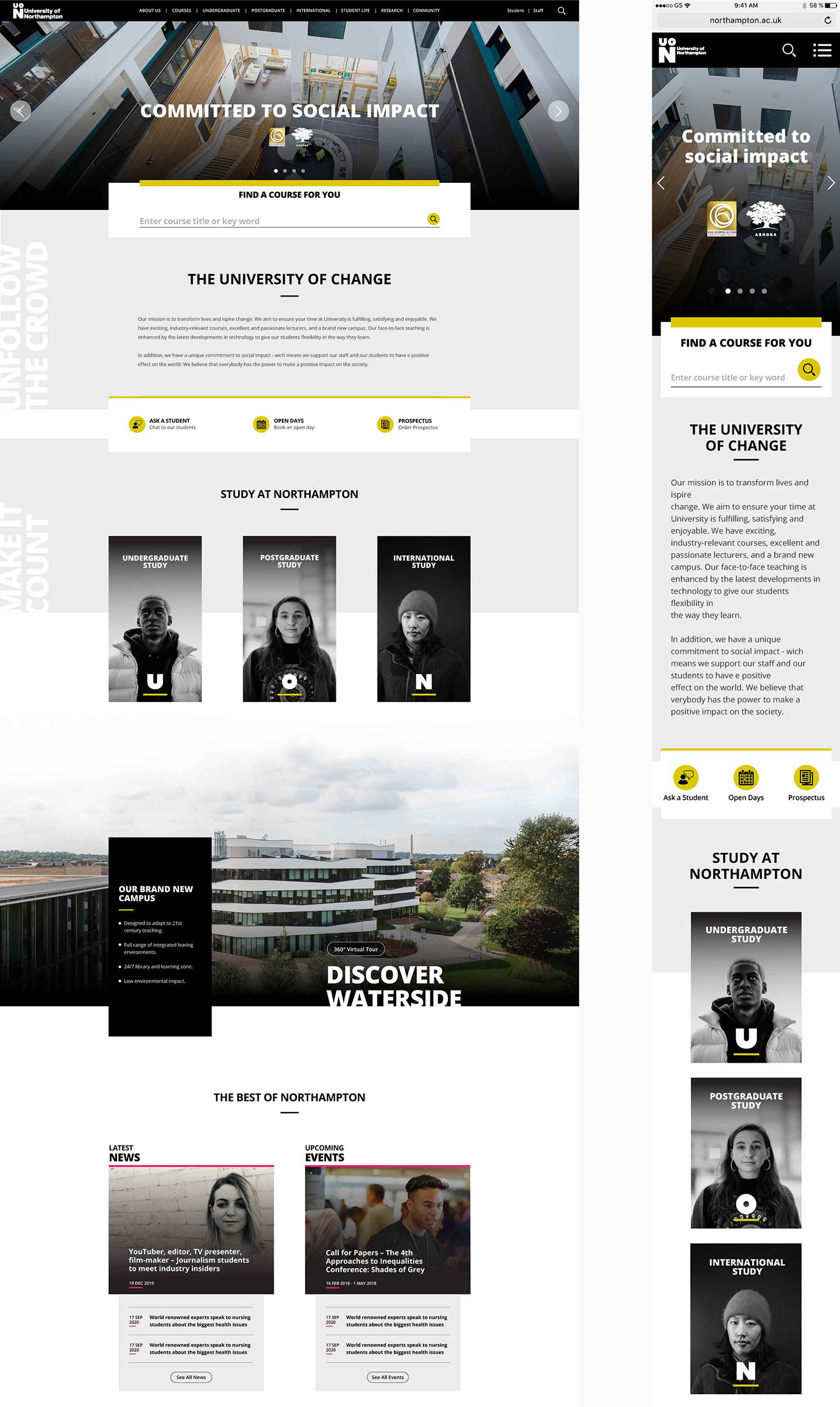
Home Page Final Design | Desktop and Mobile
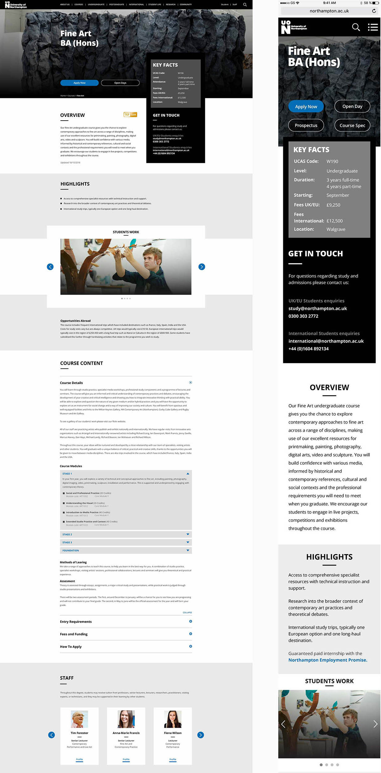
Course Template Final Design | Desktop and Mobile
Design System
Once the final design has been signed off, I started creating the Design System in order to help developers identifying recurrent elements, measures, margins, paddings etc.
I created an asset library including the Style Guide, Icons Library and a Content Guide to simplify and speed up content editors’ work.
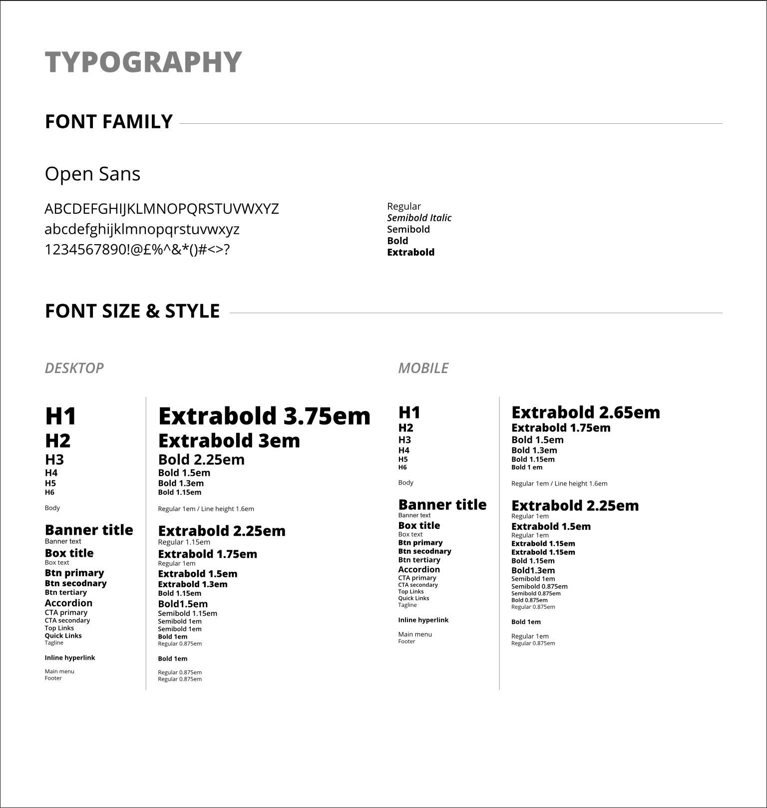
Style Guide | Typography
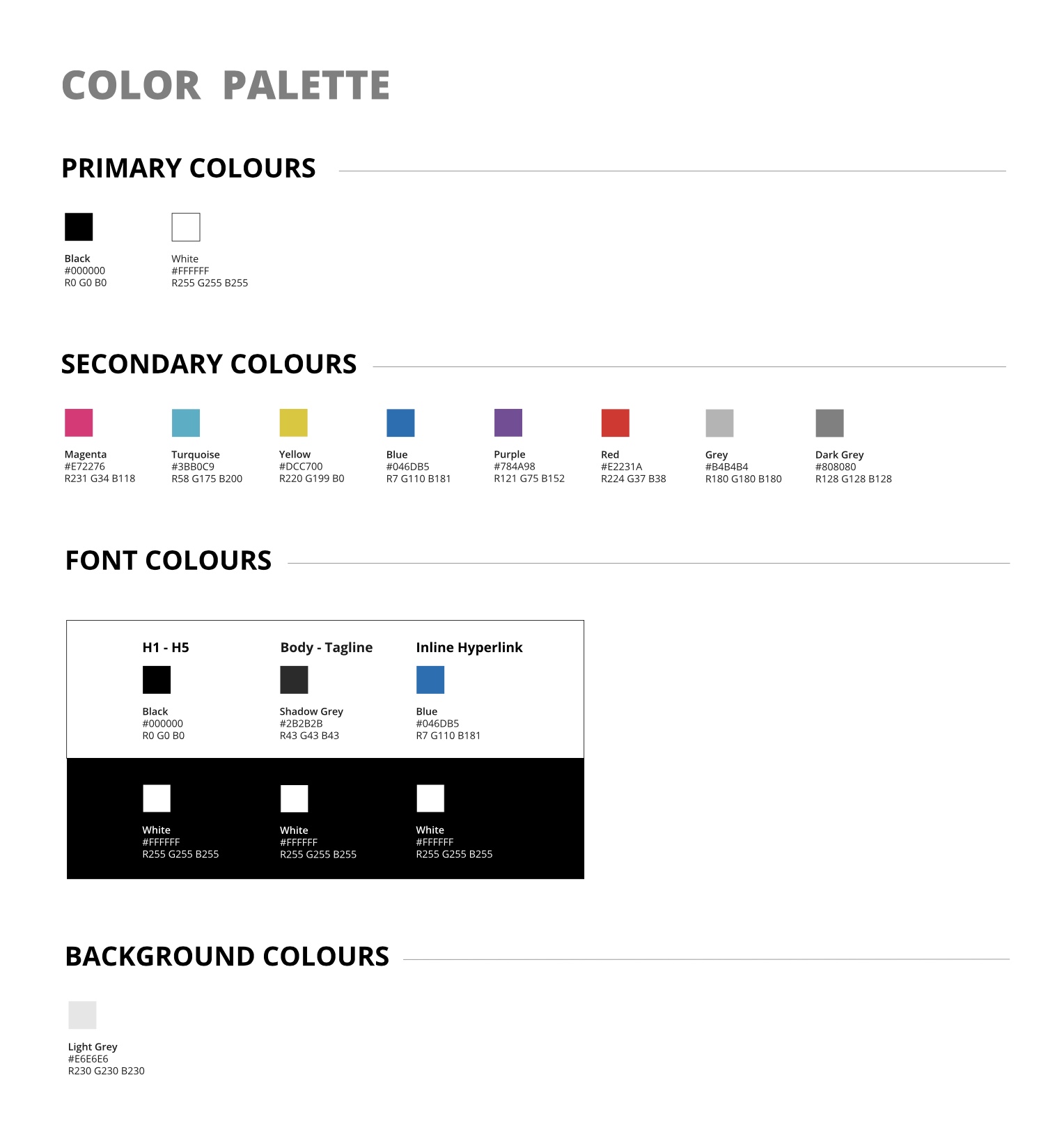
Style Guide | Colour Scheme

prototyping
After the UI has been finalised, I built an interactive hi-fi mock-up in Adobe XD.
Before submitting the prototype to a small group of users, in order to identify macro usability issues, I went through it with developers to have their feedback in terms of feasibility or other technical nuances that might have an impact on the user experience.
Prototype | Adobe XD
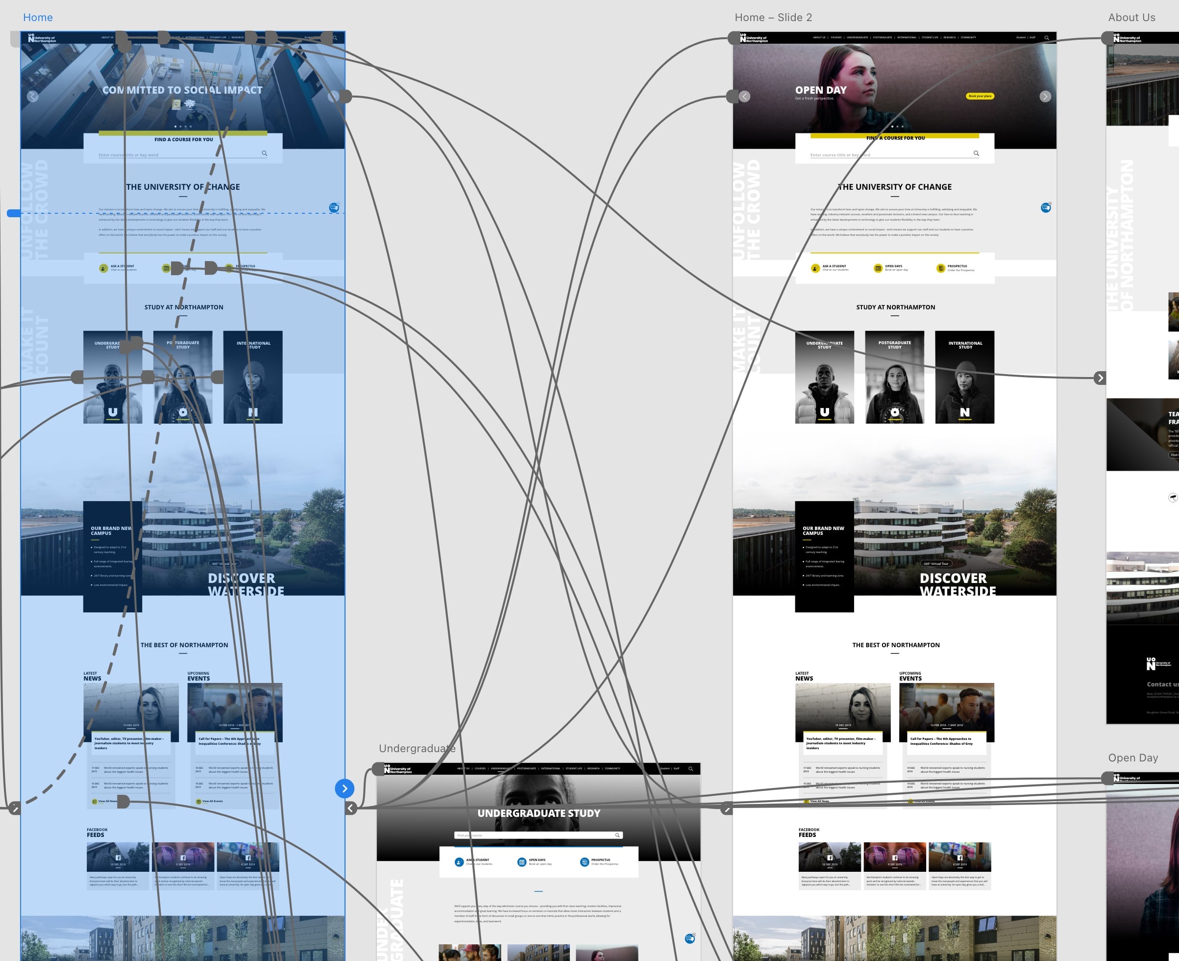
Prototype | Adobe XD
testing
The UI and UX of the website were validated through a usability test, involving students, academics and professionals.

Second Iteration
After feedbacks analysis it was clear that students wanted some content to be prioritised over other information.
This translated into a change of the displaying order of the content in the course template and in the Student Life area. It implied switching entire sections of the course template that needed to be slightly redesigned in order to properly fit in.
Academics asked for some tweaks to be applied to the Research area, resulting in a discrete change of the layout for a couple of other templates. They also asked for the possibility to add videos in the course template, driving me into a long discussion with developers to find the most optimised way to implement this request and, ultimately to apply further changes to that template.
results
The revamp has been launched in September 2020 just in time for the beginning of the academic year.
In January 2021 the SEO agency reported an overall increase of all KPIs during Q4 (Oct-Dec 2020).
The new IA together with simpler user journeys and new page layout, proved to be more efficient, allowing users to move easier through content, getting what they were looking for straight forward.
This resulted in a lower bouncing rate, an increased retention and more engagement by the users.
-
-
-
- New design perceived as outstanding by the users
- Current students were pleased
- Enrollments went up
- User journeys improved
-
-

my role
As Design Lead I have been responsible for the product full lifecycle, from design to delivery. I have been very focused trying to find the right balance between users’ needs and the business needs.
I provided user experience design, user interface design and visual design in order to make the product meet the requirements. I have been promoting and adopting an iterative approach, working closely with the developers, content editors, and final users.
The Final Product
The resulting product was a consistent website that provided a completely new student’s engagement. The revamped website, integrates a better user interface, a very pleasant aesthetic, SEO best practices and a new layout, providing a better user experience according to monthly, quarterly and yearly data.
